QML学习笔记-程序员宅基地
链接: QML Book中文版(QML Book In Chinese)
QML语言描述了用户界面元素的形状和行为。用户界面能够使用JavaScript来提供修饰,或者增加更加复杂的逻辑。
从QML元素的层次结构来理解是最简单的学习方式。子元素从父元素上继承了坐标系统,它的x,y坐标总是相对应于它的父元素坐标系统。
1、认识Qt Quick
1.1、对Qt Quick的初步认识
Qt Quick是Qt5界面开发技术的统称,是以下几种技术的集合:
- QML:界面标记语言
- JavaScript:动态脚本语言
- QT C++:跨平台C++封装库
QML是与HTML类似的一种标记语言。
QML文件采用.qml作为文件格式后缀。作为一种标记语言(类似HTML)一个QML文档有且只有一个根元素。
示例:
在这个例子中使用Image元素作为根元素,这个元素的宽度、高度与"images/background.png"图像相同。
import QtQuick 2.5

Image{

    id:root
    source: "1.png"
}
QML中不限制根元素类型,在上面这段代码中我们设置了Image元素的source属性作为我们的背景图像,它也是我们的根元素。

注意:
- 每个元素都有属性。比如Image有width和height,也会有其他的属性如srouce。Image元素的尺寸会自动与source设置的图像匹配。想要自定义Image元素的尺寸必须显式的定义width和height的值。
- 大多数标准元素都在QtQuick模块中,通常我们在导入声明中首先包含这个模块。
- id是个特殊的属性,它可以作为一个标识符在当前文档内引用对应的元素。注意
:id被定义后无法再改变,在程序执行期间也无法被赋值。
1.2、QT构建模块
QT5是由大量模块组成的。
Qt基础模块:强制性用来支持Qt平台的;
Qt附加模块:是可选的。
1.2.1、核心基础模块
- Qt Core:核心的非图形类,供其它模块使用。
- Qt GUI:图形用户界面(GUI)组件的基类,包括OpenGL。
- Qt Multimedia:音频,视频,电台,摄像头的功能类。
- Qt Network:简化方便的网络编程的类。
- Qt QML:QML类与JavaScript语言的支持。
- Qt Quick:可高度动态构建的自定义应用程序用户界面框架。
- Qt SQL:集成SQL数据库类。
- Qt Test:Qt应用程序与库的单元测试类。
- Qt WebKit:集成WebKit2的基础实现并且提供了新的QML应用程序接口。在附件模块中查看Qt WebKit Widgets可以获取更多的信息。
- Qt WebKit Widgets :Widgets 来自Qt4中集成WebKit1的窗口基础类。
- Qt Widgets:扩展Qt GUI模块的C++窗口类。
1.2.2、附加模块
- Qt 3D :一组使3D编程更加方便的应用程序接口和声明。
- Qt Bluetooth:在多平台上使用无线蓝牙技术的C++和QML应用程序接口。
- Qt Contacts:提供访问联系人与联系人数据库的C++和QML应用程序接口。
- Qt Location:提供了定位,地图,导航和位置搜索的C++与QML接口。使用NMEA在后端进行定位。(NMEA缩写,同时也是数据传输标准工业协会,在这里,实际上应为NMEA 0183。它是一套定义接收机输出的标准信息,有几种不同的格式,每种都是独立相关的ASCII格式,逗点隔开数据流,数据流长度从30-100字符不等,通常以每秒间隔选择输出,最常用的格式为”GGA”,它包含了定位时间,纬度,经度,高度,定位所用的卫星数,DOP值,差分状态和校正时段等,其他的有速度,跟踪,日期等。NMEA实际上已成为所有的GPS接收机和最通用的数据输出格式,同时它也被用于与GPS接收机接口的大多数的软件包里。)
- Qt Publish and SubScribe:Qt发布与订阅
- Qt Sensors:访问传感器的QML与C++接口。
- Qt Service Framework:允许应用程序读取,操纵和订阅来改变通知信息。
- Qt System Info :发布系统相关的信息和功能。
- Qt Versit :支持电子名片与日历数据格式(iCalendar)。(iCalendar是“日历数据交换”的标准(RFC 2445)。 此标准有时指的是“iCal”,即苹果公司的出品的一款同名日历软件,这个软件也是此标准的一种实现方式。)
- Qt Wayland:只用于Linux系统。包含了Qt合成器应用程序接口(server),和Wayland平台插件(clients)。
- Qt Feedback :反馈用户的触摸和声音操作。
- Qt JSON DB:对于Qt的一个不使用SQL对象存储。
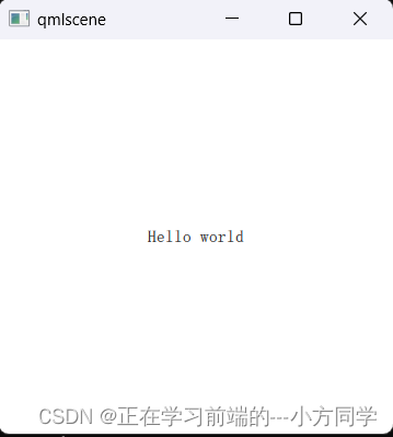
1.3、HelloWorld
import QtQuick 2.5

Rectangle{

    width: 360
    height: 360
    Text {

        anchors.centerIn: parent
        text: "Hello world"
    }
    MouseArea {

           anchors.fill: parent
           onClicked: {

               Qt.quit();
           }
    }
}
这个代码指定了显示一个360乘以360像素的一个矩形,矩形中间有一个“Hello World”的文本。鼠标区域覆盖了整个矩形,当用户点击它时,程序就会退出。
2、语法
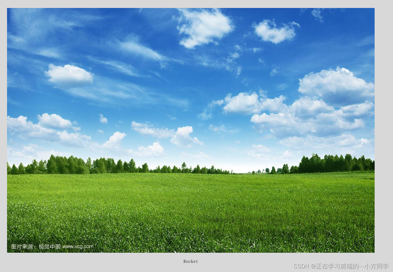
2.1、案例
import QtQuick 2.5

Rectangle{

    id:root
    width: 120
    height: 240
    color: "#D8D8D8"
    Image{

        id:rocket
        x:(parent.width-width)/2
        y:40
        source: "beijing.jpg"
    }
    Text{

        y:rocket.y+rocket.height+20
        width: root.width
        horizontalAlignment: Text.AlignHCenter
        text:'Rocket'
    }
    MouseArea{

        anchors.fill: root
        onClicked: {

            Qt.quit();
        }
    }
}
- import声明导入了一个指定的模块版本。一般来说会导入QtQuick2.0来作为初始元素的引用。
- 使用//可以单行注释,使用/**/可以多行注释,就像C/C++和JavaScript一样。
- 每一个QML文件都需要一个根元素,就像HTML一样。
- 一个元素使用它的类型声明,然后使用{}进行包含。
- 元素拥有属性,他们按照name:value的格式来赋值。
- 任何在QML文档中的元素都可以使用它们的id进行访问(id是一个任意的标识符)
- 元素可以嵌套,这意味着一个父元素可以拥有多个子元素。子元素可以通过访问parent关键字来访问它们的父元素。
2.2、qml文件的允许
$ $QTDIR/bin/qmlscene rectangle.qml
将$QTDIR替换为你的Qt的安装路径。qmlscene会执行Qt Quick运行环境初始化,并且解释这个QML文件。
2.3、属性
元素使用他们的元素类型名进行声明,使用它们的属性或者创建自定义属性来定义。一个属性对应一个值。一个属性有一个类型定义并且需要一个初始值。
示例:
import QtQuick 2.5

Rectangle{

    id:root
    width: 120
    height: 240
    color: "#D8D8D8"
    Image{

        id:rocket
        x:(parent.width-width)/2
        y:40
        source: "beijing.jpg"
    }
    Text{

        y:rocket.y+rocket.height+20
        width: root.width
        horizontalAlignment: Text.AlignHCenter
        text:'Rocket'
    }
    MouseArea{

        anchors.fill: root
        onClicked: {

            Qt.quit();
        }
    }

}
不同属性的特点:
- id是一个非常特殊的属性值,它在一个QML文件中被用来引用元素。id不是一个字符串,而是一个标识符和QML语法的一部分。一个id在一个QML文档中是唯一的,并且不能被设置为其它值,也无法被查询(它的行为更像C++世界里的指针)。
- 一个属性能够设置一个值,这个值依赖于它的类型。如果没有对一个属性赋值,那么它将会被初始化为一个默认值。
- 一个属性能够依赖一个或多个其它的属性,这种操作称作属性绑定。当它依赖的属性改变时,它的值也会更新。这就像订了一个协议,在这个例子中height始终是width的两倍。
- 添加自己定义的属性需要使用property修饰符,然后跟上类型,名字和可选择的初始化值(property : )。如果没有初始值将会给定一个系统初始值作为初始值。注意如果属性名与已定义的默认属性名不重复,使用default关键字你可以将一个属性定义为默认属性。这在你添加子元素时用得着,如果他们是可视化的元素,子元素会自动的添加默认属性的子类型链表(children property list)。
- 另一个重要的声明属性的方法是使用alias关键字(property alias : )。alias关键字允许我们转发一个属性或者转发一个属性对象自身到另一个作用域。
- ext属性依赖于自定义的timers(int整型数据类型)属性。int整型数据会自动的转换为string字符串类型数据。这样的表达方式本身也是另一种属性绑定的例子,文本结果会在times属性每次改变时刷新。
- 一些属性是按组分配的属性。当一个属性需要结构化并且相关的属性需要联系在一起时,我们可以这样使用它。另一个组属性的编码方式是 font{family: “UBuntu”; pixelSize: 24 }。
- 一些属性是元素自身的附加属性。这样做是为了全局的相关元素在应用程序中只出现一次(例如键盘输入)。编码方式.: 。
- 对于每个元素你都可以提供一个信号操作。这个操作在属性值改变时被调用。例如这里我们完成了当height(高度)改变时会使用控制台输出一个信息。
一个元素id应该只在当前文档中被引用。QML提供了动态作用域的机制,后加载的文档会覆盖之前加载文档的元素id号,这样就可以引用已加载并且没有被覆盖的元素id,这有点类似创建全局变量。但不幸的是这样的代码阅读性很差。目前这个还没有办法解决这个问题
2.4、脚本
import QtQuick 2.5

Text {

    id:label
    x:240;y:240
    property int spacePresses: 0
    text: "Space pressed: " + spacePresses + " times"
    onTextChanged: console.log("text changed to:", text)
    focus: true
    Keys.onSpacePressed: {

        increment()
    }
    Keys.onEscapePressed: {

        label.text=''
    }
    function increment(){

        spacePresses=spacePresses+1
    }
}
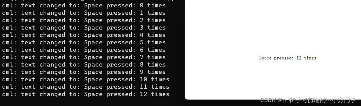
- 文本改变操作onTextChanged会将每次空格键按下导致的文本改变输出到控制台。
- 当文本元素接收到空格键操作(用户在键盘上点击空格键),会调用JavaScript函数increment()。
- 定义一个JavaScript函数使用这种格式function (){….},在这个例子中是增加spacePressed的计数。每次spacePressed的增加都会导致它绑定的属性更新。
注意:
QML的(属性绑定)与JavaScript的=(赋值)是不同的。绑定是一个协议,并且存在于整个生命周期。然而JavaScript赋值(=)只会产生一次效果。QML当一个新的绑定生效或者使用JavaScript赋值给属性时,绑定的生命周期就会结束。例如一个按键的操作设置文本属性为一个空的字符串将会销毁我们的增值显示
Keys.onEscapePressed: {

    label.text = ''
}
在点击取消(ESC)后,再次点击空格键(space-bar)将不会更新我们的显示,之前的text属性绑定(text: “Space pressed:” + spacePresses + “times”)被销毁。
当你对改变属性的策略有冲突时(文本的改变基于一个增值的绑定并且可以被JavaScript赋值清零),类似于这个例子,你最好不要使用绑定属性。你需要使用赋值的方式来改变属性,属性绑定会在赋值操作后被销毁(销毁协议!)。
3、基本元素
元素可以分为可视化元素与非可视化元素。
可视化元素: 有着几何形状并且可以在屏幕上显示;
非可视化元素: 提供了常用功能(例如计时器),通常用于操作可视化元素。
基础的可视化元素,例如:Item(基础元素对象),Rectangle(矩形框),Text(文本),Image(图像)和MouseArea(鼠标区域)。
3.1、元素基础对象Item
Item(基础元素对象)是所有可视化元素的基础对象,所有其它的可视化元素都继承自Item。它自身不会有任何绘制操作,但是定义了所有可视化元素共有的属性:
| Group(分组) | Properties(属性) |
|---|---|
| Geometry(几何属性) | 1、x,y(坐标)定义了元素左上角的位置; 2、width,height(长和宽)定义元素的显示范围; 3、z(堆叠次序)定义元素之间的重叠顺序。 |
| Layout handling(布局操作) | anchors(锚定),包括左(left),右(right),上(top),下(bottom),水平与垂直居中(vertical center,horizontal center),与margins(间距)一起定义了元素与其它元素之间的位置关系。 |
| Key handlikng(按键操作) | 1、附加属性key(按键)和keyNavigation(按键定位)属性来控制按键操作; 2、处理输入焦点(focus)可用操作。 |
| Key handlikng(按键操作) | 附加属性key(按键)和keyNavigation(按键定位)属性来控制按键操作; 处理输入焦点(focus)可用操作。 |
| Transformation(转换) | 缩放(scale)和rotate(旋转)转换,通用的x,y,z属性列表转换(transform),旋转基点设置(transformOrigin)。 |
| Visual(可视化) | 1、不透明度(opacity)控制透明度, 2、visible(是否可见)控制元素是否显示, 3、clip(裁剪)用来限制元素边界的绘制, 4、smooth(平滑)用来提高渲染质量。 |
| State definition(状态定义) | states(状态列表属性)提供了元素当前所支持的状态列表,当前属性的改变也可以使用transitions(转变)属性列表来定义状态转变动画。 |
Item(基本元素对象)通常被用来作为其它元素的容器使用,类似HTML语言中的div元素(div element)
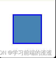
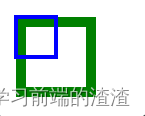
3.2、矩形框元素Rectangle
Rectangle(矩形框)是基本元素对象的一个扩展,增加了一个颜色来填充它。它还支持边界的定义,
- border.color:边界颜色
- border.widt:边界宽度,来自定义边界
- radius:半径,创建一个圆角矩形。
颜色的命名是来自SVG颜色的名称。你也可以使用其它的方法来指定颜色,比如RGB字符串(’#FF4444’),或者一个颜色名字(例如’white’)。
import QtQuick 2.0
Item{
id:root
Rectangle {
id:rect1
x:12;y:12
width:50;height:200
color: '#555555'
}
Rectangle {
id: rect2
x: 112; y: 12
width: 76; height: 96
border.color: "lightsteelblue"
border.width:4
radius: 8
}
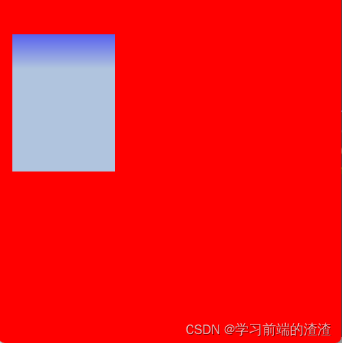
//渐变色
Rectangle{
id:rect3
x:200;y:12
width: 200;height: 200
gradient: Gradient{
GradientStop{
position:0.0;color:"lightsteelblue"}
GradientStop {
position: 1.0; color: "slategray" }
}
border.color: "slategray"
}
}

一个渐变色是由一系列的梯度值定义的。每一个值定义了一个位置与颜色。位置标记了y轴上的位置(0 = 顶,1 = 底)。GradientStop(倾斜点)的颜色标记了颜色的位置。
一个矩形框如果没有width/height(宽度与高度)将不可
3.3、文本元素Text
显示文本需要使用Text元素(Text Element)。text属性会使用给出的text(文本)与font(字体)来计算初始化的宽度与高度。可以使用字体属性组来(font property group)来改变当前的字体,例如font.family,font.pixelSize,等等。改变文本的颜色值只需要改变颜色属性就可以了。
- horizontalAlignment与verticalAlignment:设置它的对齐效果。
- style和styleColor:配置文字的外框效果,浮雕效果或者凹陷效果。
- elide:文本过长,显示省略号。elide属性允许你设置文本左边,右边或者中间的省略位置
- wrapMode:使用文字换行的方式显示所有的文本
(这个属性只在明确设置了宽度后才生效)
import QtQuick 2.5

Item  {

    width: 400
    height: 400

    Text {

        id: test
        width: 100
        height: 120
        text: "The quick brown fox"
        color: "#303030"
        font.family: "Ubuntu"
        font.pixelSize: 30
        //中间省略
        elide: Text.ElideMiddle
        style: Text.Sunken
        styleColor: '#FF4444'
        verticalAlignment: Text.AlignTop
        //换行显示完整文本
		// wrapMode: Text.WordWrap
    }
}
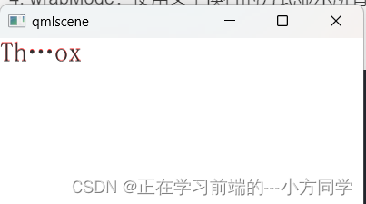
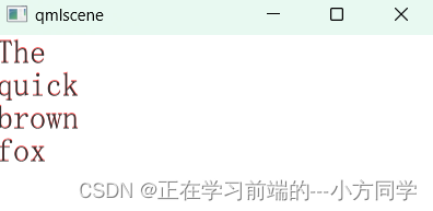
一个text元素(text element)只显示的文本,它不会渲染任何背景修饰。
注意:
文本元素(Text Element)的初始宽度与高度是依赖于文本字符串和设置的字体这一点很重要。一个没有设置宽度或者文本的文本元素(Text Element)将不可见,默认的初始宽度是0。
通常你想要对文本元素布局时,你需要区分文本在文本元素内部的边界对齐和由元素边界自动对齐。前一种情况你需要使用horizontalAlignment和verticalAlignment属性来完成,后一种情况你需要操作元素的几何形状或者使用anchors(锚定)来完成。
3.4、图像元素Image
一个图像元素能够显示不同格式的图像(例如PNG,JPG,GIF,BMP)。
import QtQuick 2.5

Item {

    width: 1800
    height: 2500


    Image {

        id: img1
        x:14;y:14
        source: "img/jinyan.png"
    }

    Image {

        id: img2
        x:1200;y:14
        width: 100
        height: 600/2
        source: "img/jinyan.png"
        fillMode: Image.PreserveAspectCrop
        clip: true
    }


}
注意:
一个URL可以是使用’/‘语法的本地路径(”./images/home.png”)或者一个网络链接
图像元素使用PreserveAspectCrop可以避免裁剪图像数据被渲染到图像边界外。默认情况下裁剪是被禁用的(clip:false)。你需要打开裁剪(clip:true)来约束边界矩形的绘制。这对任何可视化元素都是有效的。
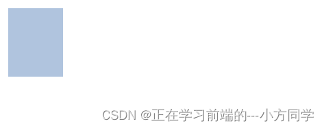
3.5、鼠标区域元素MouseArea
当用户与可视化端口交互时,mouseArea通常被用来与可视化元素对象一起执行命令。
import QtQuick 2.5

Item {


    width: 1920
    height: 1080

    Rectangle{

        id:rect1
        x:12;y:12
        width: 80;height: 100
        color: "lightsteelblue"

        MouseArea {

            id:area
            width: parent.width
            height: parent.height
            onClicked: rect2.visible=!rect2.visible
        }
    }

    Rectangle{

        id:rect2
        x:100;y:12
        width: 80;height: 100
        border.color: "lightsteelblue"
        border.width: 5
        radius: 8
    }
}
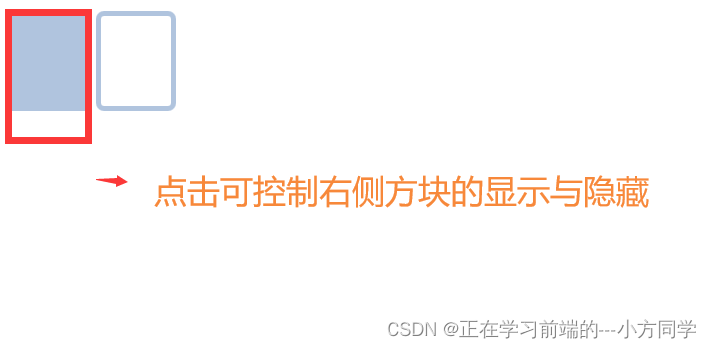
这是QtQuick中非常重要的概念,输入处理与可视化显示分开。这样你的交互区域可以比你显示的区域大很多。
4、组件
一个组件是一个可以重复使用的元素,QML提供几种不同的方法来创建组件。
- 一个文件就是一个基础组件。
import QtQuick 2.5
Item {
width: 1920
height: 1080
Rectangle {
id:button
x:12;y:12
width: 116
height: 26
color:"lightsteelblue"
border.color: "slategrey"
Text {
anchors.centerIn: parent
text:'start'
}
MouseArea {
anchors.fill: parent
onClicked: {
status.text="Button clicked!"
}
}
}
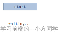
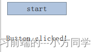
Text{
id:status
x:12;y:76
width: 116;height: 26
text:'waiting...'
horizontalAlignment: Text.AlignHCenter
}
}
目标:将这个按钮提取为可重复使用的组件。
我想要使用text属性来设置文本,然后实现我们自己的点击操作。我也期望这个按钮有一个比较合适的初始化大小(例如width:240)。创建了一个Button.qml文件,在根级添加一个属性导出方便使用者修改它。
我们在根级导出了文本和点击信号。通常我们命名根元素为root让引用更加方便。我们使用了QML的alias(别名)的功能,它可以将内部嵌套的QML元素的属性导出到外面使用。只有根级目录的属性才能够被其它文件的组件访问。
// Button.qml

import QtQuick 2.5

Rectangle{

    id:root
    property alias text: label.text
    signal clicked
    width: 116
    height: 26
    color: "lightsteelblue"
    border.color: "slategrey"

    Text {

        id:label
        text:'start'
        anchors.centerIn: parent
    }
    MouseArea {

        anchors.fill: parent
        onClicked: {

            root.clicked()
        }
    }
}
import QtQuick 2.5

Item {

    width: 1920
    height: 1080

    Button {

       id:button
       x:12;y:12
       text:'Start'
       onClicked: {

           status.text='Button clicked!'
       }
   }
   Text{

       id:status
       x:12;y:76
       width: 116
       height: 26
       text:'waiting...'
       horizontalAlignment: Text.AlignHCenter
   }
}
可以更进一步的使用基础元素对象(Item)作为根元素。这样可以防止用户改变我们设计的按钮的颜色,并且可以提供出更多相关控制的API(应用程序接口)
5、简单的转换
转换操作改变了一个对象的几何状态。QML元素对象通常能够被平移,旋转,缩放。
- 简单的位移:改变x,y坐标
- 旋转:改变rotation,使用角度作为单位(0~360)
- 缩放:改变scale(比例),小于1–>缩小,大于1–>放大
旋转与缩放不会改变对象的几何形状,对象的x,y(坐标)与width/height(宽/高)也类似。
ClickableImage元素:e仅仅是一个包含鼠标区域的图像元素。我们遵循一个简单的原则,三次使用相同的代码描述一个用户界面最好可以抽象为一个组件。
import QtQuick 2.5

Item {

    id:root
    signal clicked
    property alias source: img.source

    Image {

        id:img
        anchors.fill: parent
        source: "img/1.png"

        MouseArea {

            anchors.fill: parent
            onClicked: root.clicked()
        }
    }
}
点击每个风车执行一种简单的转换。点击背景将会重置场景。
import QtQuick 2.5

Item {


    width: bg.width
    height: bg.height
    Image {

        id:bg
        source: "img/beijing.jpg"
    }
    MouseArea{

        id:backgroundClicker
        anchors.fill: parent
        //点击背景区域进行重置
        onClicked: {

            rock1.x=20
            rock2.rotation=0
            rock3.rotation=0
            rock3.scale=1
        }
    }
    ClickableImage{

        id:rock1
        x:20
        y:100
        width: 100
        height: 100
        source:"img/1.png"
        //点击x向右移动5
        onClicked: {

            x+=5
        }
    }
    ClickableImage{

        id:rock2
        x:200
        y:100
        width: 100
        height: 100
        source:"img/1.png"
        smooth: true
        //点击旋转5度
        onClicked: {

            rotation+=5
        }
    }
    ClickableImage{

        id:rock3
        x:400
        y:100
        width: 100
        height: 100
        source:"img/1.png"
        //smooth:true提高图片显示质量。
        smooth: true
        //点击旋转5度,缩小0.05
        onClicked: {

            rotation+=5
            scale-=0.05
        }
    }
}
qml简单的转换
smooth:true来增加反锯齿由于性能的原因通常是被关闭的。
由于风车2后出现在代码中,风车2将会放在风车1上面。这同样适用于MouseArea(鼠标区域),一个后出现在代码中的鼠标区域将会与之前的鼠标区域重叠,后出现的鼠标区域才能捕捉到鼠标事件。
6、定位元素
有一些QML元素被用于放置元素对象,它们被称作定位器,QtQuick模块提供了Row,Column,Grid,Flow用来作为定位器。
创建3个组件,方便重复使用,每一个组件都包含了一个48乘48的着色区域
//BlueSquare.qml
import QtQuick 2.5

Rectangle{

    width: 48
    height: 48
    color: "blue"
    border.color: Qt.lighter(color)
}


//GreenSquare.qml
import QtQuick 2.5

Rectangle{

    width: 48
    height: 48
    color: "green"
    border.color: Qt.lighter(color)
}


//RedSquare.qml

import QtQuick 2.5

Rectangle{

    width: 48
    height: 48
    color: "red"
    border.color: Qt.lighter(color)
}
Qt.lighter(color)来指定了基于填充色的边界高亮色。
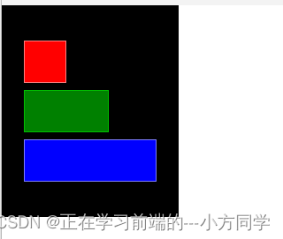
6.1、Column列
Column(列)元素将它的子对象通过顶部对齐的列方式进行排列。spacing属性用来设置每个元素之间的间隔大小。
import QtQuick 2.5

Item {

    id: root
    width: 1280
    height: 680

    Rectangle {

        width: 200
        height: 240
        color: 'black'
        Column {

            id: column
            anchors.centerIn: parent
            spacing: 8
            RedSquare {
     }
            GreenSquare {
     width: 96 }
            BlueSquare {
     width: 150 }
        }
    }
}
6.2、Row行
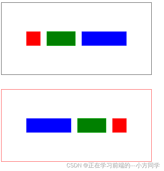
Row(行)元素将它的子对象从左到右,或者从右到左依次排列,排列方式取决于layoutDirection属性。spacing属性用来设置每个元素之间的间隔大小。
import QtQuick 2.5

Item {

    id: root
    width: 1280
    height: 680

    Rectangle{

        x:12;y:12
        width: 500
        height: 240
        border.color: 'black'
        Row{

            id:row1
            anchors.centerIn: parent
            spacing: 20
            RedSquare {
     }
            GreenSquare {
     width: 96 }
            BlueSquare {
     width: 150 }
        }
    }


    Rectangle{

        x:12;y:300
        width: 500
        height: 240
        border.color: 'red'
        Row{

            id:row2
            anchors.centerIn: parent
            spacing: 20
            //决定排列方式
            layoutDirection: "RightToLeft"
            RedSquare {
     }
            GreenSquare {
     width: 96 }
            BlueSquare {
     width: 150 }
        }
    }
}
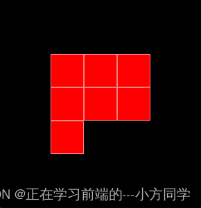
6.3、Grid栅格
Grid(栅格)元素通过设置rows(行数)和columns(列数)将子对象排列在一个栅格中。可以只限制行数或者列数。如果没有设置它们中的任意一个,栅格元素会自动计算子项目总数来获得配置.属性flow(流)与layoutDirection(布局方向)用来控制子元素的加入顺序。spacing属性用来控制所有元素之间的间隔。
import QtQuick 2.5

Item {

    id:root
    width: rect.width
    height: rect.height

    Rectangle{

        id:rect
        width: 300
        height: 300
        color: 'black'

        Grid{

            anchors.centerIn: parent
            rows:3
            columns:3
            RedSquare {
    }
            RedSquare {
    }
            RedSquare {
    }
            RedSquare {
    }
            RedSquare {
    }
            RedSquare {
    }
            RedSquare {
    }
        }
    }
}
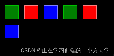
6.4、Flow流
通过flow(流)属性和layoutDirection(布局方向)属性来控制流的方向。它能够从头到底的横向布局,也可以从左到右或者从右到左进行布局。
为了让一个流可以工作,必须指定一个宽度或者高度,可以通过属性直接设定,或者通过anchor(锚定)布局设置。
import QtQuick 2.5

Item {

    id:root
    width: rect.width
    height: rect.height
    Rectangle{

        id:rect
        width: 400
        height: 200
        color:'black'
        Flow{

            anchors.margins: 20
            anchors.fill: parent

            spacing: 20
            GreenSquare {
    }
            RedSquare {
    }
            BlueSquare {
    }
            GreenSquare {
    }
            RedSquare {
    }
            BlueSquare {
    }

        }
    }
}
6.5、重复
通常Repeater(重复元素)与定位器一起使用。它的工作方式就像for循环与迭代器的模式一样。
import QtQuick 2.5

Item {


    id:root
    width: 500
    height: 500

    Rectangle{

        id:rect
        anchors.fill: parent
        property variant colorArr:  ["#00bde3", "#67c111", "#ea7025"]

        Grid{

            anchors.fill: parent
            anchors.margins: 8
            spacing: 4
            Repeater{

                model: 16
                Rectangle{

                    width: 56
                    height: 56
                    property int colorIndex: Math.floor(Math.random()*3)
                    color:rect.colorArr[colorIndex]
                    border.color:Qt.lighter(color)
                    Text{

                        anchors.fill: parent
                        color: "#f0f0f0"
                        text:'CELL'+index
                    }

                }
            }
        }
    }
}
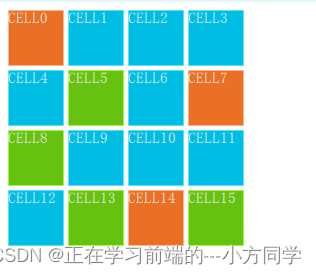
使用了JS数学函数Math.floor(Math.random()*3)来选择颜色。这个函数会给我们生成一个0~2的随机数。
一个重复元素循环时有一个index(索引)属性值。
7、布局元素
使用anchors(锚)对元素进行布局。
anchoring(锚定)是基础元素对象的基本属性,可以被所有的可视化QML元素使用。一个anchors(锚)就像一个协议,并且比几何变化更加强大。Anchors(锚)是相对关系的表达式
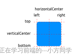
一个元素有6条锚定线(top顶,bottom底,left左,right右,horizontalCenter水平中,verticalCenter垂直中)。
在文本元素(Text Element)中有一条文本的锚定基线(baseline)。每一条锚定线都有一个偏移(offset)值,在top(顶),bottom(底),left(左),right(右)的锚定线中它们也被称作边距。
对于horizontalCenter(水平中)与verticalCenter(垂直中)与baseline(文本基线)中被称作偏移值。
//GreenSquare.qml
import QtQuick 2.5

Rectangle{

    width: 100
    height: 100
    color: "green"
    border.color: Qt.lighter(color)
}


//BlueSquare.qml
import QtQuick 2.5

Rectangle{

    id:root
    width: 100
    height: 100
    color: "blue"
    border.color: Qt.lighter(color)
    property alias text: text1.text
    Text {

        id: text1
        text: '(1)'
        anchors.centerIn: parent
    }
}
- 元素填充它的父元素。
  GreenSquare {

        BlueSquare {

            width: 12
            //设置的width失效
            anchors.fill: parent
            anchors.margins: 8
            text: '(1)'
        }
    }
- 元素左对齐它的父元素。
GreenSquare {

        x:150
        BlueSquare {

            width: 50
            height: 50
            y:8
            anchors.left:parent.left
            anchors.leftMargin:  8
            text: '(2)'
        }
    }
- 元素的左边与它父元素的右边对齐。
    GreenSquare {

        x:270
        BlueSquare {

            width: 50
            height: 50
            anchors.left:parent.right
            text: '(3)'
        }
    }
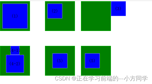
- 元素中间对齐。Blue1与它的父元素水平中间对齐。Blue2与Blue1中间对齐,并且它的顶部对齐Blue1的底部。
   GreenSquare {

        y:150
        BlueSquare {

            id:blue1
            width: 30
            height: 30
            anchors.horizontalCenter: parent.horizontalCenter
            text: '(4-1)'
        }
        BlueSquare {

            id:blue2
            width: 60
            height: 60
            anchors.top:blue1.bottom
            anchors.horizontalCenter: blue1.horizontalCenter
            text: '(4-2)'
        }
    }
- 元素在它的父元素中居中。
 GreenSquare{

        x:150
        y:150
        BlueSquare{

            width: 50
            height: 50
            anchors.centerIn: parent
            text:'(5)'
        }
    }
- 元素水平方向居中对齐父元素并向后偏移12像素,垂直方向居中对齐。
 GreenSquare{

        x:270
        y:150
        BlueSquare{

            width: 50
            height: 50
            anchors.verticalCenter: parent.verticalCenter
            anchors.horizontalCenter: parent.horizontalCenter
            anchors.horizontalCenterOffset: -12
            text:'(5)'
        }
    }
8、输入元素
MouseArea(鼠标区域)作为鼠标输入元素(前面章节3.5)。
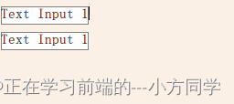
8.1、文本输入TextInput
文本输入允许用户输入一行文本。这个元素支持使用正则表达式验证器来限制输入和输入掩码的模式设置。
import QtQuick 2.5

Rectangle{

    width: 500
    height: 500
    color: "linen"

    Rectangle{

        x:8;y:8
        width: 96
        height: 20
        border.color: "gray"
        TextInput{

            id:input1

            anchors.fill: parent
            focus: true
            text:'Text Input 1'
            //通过键盘改变焦点,KeyNavigation(按键向导)附加属性可以预先设置一个元素id绑定切换焦点的按键。
            KeyNavigation.tab: input2
        }
    }
    Rectangle{

        x:8;y:36
        width: 96
        height: 20

        border.color: "gray"
        TextInput{

            id:input2
            anchors.fill: parent
            focus: true
            text:'Text Input 1'
            //通过键盘改变焦点,KeyNavigation(按键向导)附加属性可以预先设置一个元素id绑定切换焦点的按键。
            KeyNavigation.tab: input1
        }
    }

}
8.2、焦点区域FocusScope
一个焦点区域(focus scope)定义了如果焦点区域接收到焦点,它的最后一个使用focus:true的子元素接收焦点,它将会把焦点传递给最后申请焦点的子元素。
创建一个组件TLineEdit1,使用焦点区域(focus scope)作为根元素。
//TLineEditV1.qml
import QtQuick 2.5

FocusScope {

    width: 96
    height: input.height+8
    Rectangle{

        anchors.fill: parent
        color: "lightsteelblue"
        border.color: 'gray'
    }

    property alias text: input.text
    property alias input: input
    TextInput{

        id:input
        anchors.fill: parent
        anchors.margins:4
        focus: true

    }
}
如果想要完整的导出TextInput元素,你可以使用property alias input: input来导出这个元素。 第一个input是属性名字,第二个input是元素id。
//FocusScope.qml
import QtQuick 2.5

Rectangle{

    width: 500
    height: 500
    color: "linen"
    TLineEdit1{

        id:input1
        x:8;y:8
        width: 96
        height: 50
        focus: true
        text:'Text Input 1'
        //通过键盘改变焦点,KeyNavigation(按键向导)附加属性可以预先设置一个元素id绑定切换焦点的按键。
        KeyNavigation.tab: input2
    }
    TLineEdit1{

        id:input2
        x:8;y:100
        width: 96
        height: 20
        text:'Text Input 2'
        //通过键盘改变焦点,KeyNavigation(按键向导)附加属性可以预先设置一个元素id绑定切换焦点的按键。
        KeyNavigation.tab: input1
    }
}
qml tab键切换焦点
按下Tab按键可以成功的在两个组件之间切换焦点,并且能够正确的将焦点锁定在组件内部的子元素中。
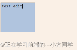
8.3、文本编辑TextEdit
文本编辑(TextEdit)元素与文本输入(TextInput)非常类似,它支持多行文本编辑。它不再支持文本输入的限制,但是提供了已绘制文本的大小查询(paintedHeight,paintedWidth)。
创建组件TTextEdit,可以编辑它的背景,使用focus scope(焦点区域)来更好的切换焦点。
//TTextEdit.qml
import QtQuick 2.5

FocusScope {

    width: 96
    height: 96
    Rectangle{

        anchors.fill: parent
        color: "lightsteelblue"
        border.color: 'gray'
    }
    property alias text: input.text
    property alias input: input

    TextEdit {

        id:input
        anchors.fill: parent
        anchors.margins: 4
        focus: true
    }
}
//textEdit.qml
import QtQuick 2.5

Rectangle{

    width: 500
    height: 500
    color: 'linen'

    TTextEdit{

        id:input
        x:8;y:8
        width: 120
        height: 104
        focus: true
        text: 'text edit'
    }
}
8.4、按键元素Key Element
附加属性key允许你基于某个按键的点击来执行代码。例如使用up,down按键来移动一个方块,left,right按键来旋转一个元素,plus,minus按键来缩放一个元素。
import QtQuick 2.5

Rectangle{

    width: 500
    height: 500
    color: 'black'


    Rectangle{

        id:square
        x:8;y:8
        width: 50
        height: 50
        color: 'green'
    }
    focus: true

    Keys.onLeftPressed: square.x-=8
    Keys.onRightPressed: square.x+=8
    Keys.onUpPressed: square.y-=8
    Keys.onDownPressed: square.y+=8

    Keys.onPressed: {

        switch(event.key){

        case Qt.Key_Plus:
            square.scale+=0.2
            break;
        case Qt.Key_Minus:
            square.scale-=0.2
            break;
        }
    }

}
qml按键移动、缩放元素
9、动态元素
9.1、动画
动画被用于属性的改变。一个动画定义了属性值改变的曲线,将一个属性值变化从一个值过渡到另一个值。动画是由一连串的目标属性活动定义的,平缓的曲线算法能够引发一个定义时间内属性的持续变化。所有在QtQuick中的动画都由同一个计时器来控制,因此它们始终都保持同步,这也提高了动画的性能和显示效果。
动画控制了属性的改变,也就是值的插入。这是一个基本的概念,QML是基于元素,属性与脚本的。每一个元素都提供了许多的属性,每一个属性都在等待使用动画。 动画控制了属性的改变,每个元素都有大量的属性供你任意使用。
//animation.qml
import QtQuick 2.5

Image{

    source: "img/beijing.jpg"

    Image {

        x:40;y:80
        width: 200
        height: 200
        source: "img/1.png"


        NumberAnimation on x{

            to:240
            duration: 4000
            loops: Animation.Infinite

        }

        RotationAnimation on rotation {

            to:360
            duration: 4000
            loops: Animator.Infinite
        }
    }
}
上面这个例子在x坐标和旋转属性上应用了一个简单的动画。每一次动画持续4000毫秒并且永久循环。x轴坐标动画展示了风车的x坐标逐渐移至240,旋转动画展示了当前角度到360度的旋转。两个动画同时运行,并且在加载用户界面完成后开始。
//animation.qml
import QtQuick 2.5

Image{

    source: "img/beijing.jpg"

    Image {

        x:40;y:80
        width: 200
        height: 200
        source: "img/1.png"


        NumberAnimation on x{

            to:240
            duration: 4000
            loops: Animation.Infinite

        }

        RotationAnimation on rotation {

            to:360
            duration: 4000
            loops: Animator.Infinite
        }
    }
}
qml动画1
9.1.1、动画元素
有几种类型的动画,每一种都在特定情况下都有最佳的效果,列出了一些常用的动画:
- PropertyAnimation(属性动画):使用属性值改变播放的动画
- NumberAnimation(数字动画): 使用数字改变播放的动画
- ColorAnimationColorAnimation:使用颜色改变播放的动画
- RotationAnimation(旋转动画):使用旋转改变播放的动画
除了上面这些基本和通常使用的动画元素,QtQuick还提供了一切特殊场景下使用的动画:
- PauseAnimation(停止动画):运行暂停一个动画
- SequentialAnimation(顺序动画): 允许动画有序播放
- ParallelAnimation(并行动画):允许动画同时播放
- AnchorAnimation(锚定动画):使用锚定改变播放的动画
- ParentAnimation(父元素动画):使用父对象改变播放的动画
- SmotthedAnimation(平滑动画):跟踪一个平滑值播放的动画
- SpringAnimation(弹簧动画):跟踪一个弹簧变换的值播放的动画
- PathAnimation(路径动画):跟踪一个元素对象的路径的动画
- Vector3dAnimation(3D容器动画):使用QVector3d值改变播放的动画
当使用更加复杂的动画时,我们可能需要在播放一个动画时中改变一个属性或者运行一个脚本。对于这个问题,QtQuick提供了一个动作元素:
- PropertyAction(属性动作):在播放动画时改变属性
- ScriptAction(脚本动作):在播放动画时运行脚本
9.1.2、应用动画
动画可以通过以下几种方式来应用:
- 属性动画 : 在元素完整加载后自动运行
- 属性动作:当属性值改变时自动运行
- 独立运行动画:使用start()函数明确指定运行或者running属性被设置为true(比如通过属性绑定)
//ClickableImageV2
import QtQuick 2.5

Item {


    id:root
    width: container.childrenRect.width
    height:container.childrenRect.height
    property alias text: label.text
    property alias source: image.source
    signal clicked

    Column{

        id:container
        Image {

            id: image
            width: 100
            height: 100

        }
        Text{

            id:label
            width: image.width
            horizontalAlignment:Text.AlignHCenter
            wrapMode:Text.WordWrap
            color:'#111111'
        }
    }
    MouseArea{

        anchors.fill: parent
        onClicked: root.clicked()
    }
}
- 使用Column(列)定位器,并且使用基于列的子矩形(childRect)属性来计算它的宽度和高度(width and height)。
- 导出了文本(text)和图形源(source)属性,一个点击信号(clicked signal)。
- 使用文本元素的wrapMode属性来设置文本与图像一样宽并且可以自动换行。
由于几何依赖关系的反向(父几何对象依赖于子几何对象)我们不能对ClickableImageV2设置宽度/高度(width/height),因为这样将会破坏我们已经做好的属性绑定。
import QtQuick 2.5

Item {

    width:1400
    height: 800
    //第一个风车使用了Animation on 属性变化的策略来完成。动画会在加载完成后立即播放
    ClickableImageV2{

        id:rocket1
        x:40;y:200
        source: "img/1.png"
        text:"animation on property"
        NumberAnimation on y {

            to:40
            duration: 4000
        }
    }

    //使用了behavior on 属性行为策略的动画。这个行为告诉属性值每时每刻都在变化,通过动画的方式来改变这个值。
    //可以使用行为元素的enabled : false来设置行为失效。当你点击这个火箭时它将会开始运行(y轴坐标逐渐移至40)。
    ClickableImageV2{

        id:rocket2
        x:200;y:200
        source: "img/1.png"
        text:"behavior on property"
        Behavior on y {

            NumberAnimation{

            duration: 4000
            }
        }
    //onClicked: y=40
        onClicked: y = 40+Math.random()*(205-40)
    }

    //使用standalone animation独立动画策略。这个动画由一个私有的元素定义并且可以写在文档的任何地方。
    //点击风车调用动画函数start()来启动动画。每一个动画都有start(),stop(),resume(),restart()函数。这个动画自身可以比其他类型的动画更早的获取到更多的相关信息。
    //我们只需要定义目标和目标元素的属性需要怎样改变的一个动画。我们定义一个to属性的值,在这个例子中我们也定义了一个from属性的值允许动画可以重复运行。
    ClickableImageV2{

        id:rocket3
        x:400;y:200
        source: "img/1.png"
        onClicked: anim.start()
//        onClicked: anim.restart()
        text:"standalone animation"

        NumberAnimation {

            id:anim
            target: rocket3
            properties: "y"
            from: 205
            to:40
            duration: 4000
        }
    }
}
qml动画2
另一个启动/停止一个动画的方法是绑定一个动画的running属性。当需要用户输入控制属性时这种方法非常有用:
    NumberAnimation {

        ...
        // animation runs when mouse is pressed
        running: area.pressed
    }
    MouseArea {

        id: area
    }
9.1.3、缓冲曲线
属性值的改变能够通过一个动画来控制,缓冲曲线属性影响了一个属性值改变的插值算法。
我们现在已经定义的动画都使用了一种线性的插值算法,因为一个动画的默认缓冲类型是Easing.Linear。
//ClickableImageV3
import QtQuick 2.5

Item {


    id:root
    width: container.childrenRect.width+16
    height:container.childrenRect.height+16
    property alias text: label.text
    property alias source: image.source
    signal clicked

    property bool framed: false


    Rectangle{

        anchors.fill: parent
        color:"red"
        visible: root.framed
    }

    Column{

        id:container
        anchors.centerIn: parent

        Image {

            id: image
            width: 100
            height:100

        }
        Text{

            id:label
            width: image.width
            horizontalAlignment:Text.AlignHCenter
            wrapMode:Text.WordWrap
            color:'#111111'
        }
    }

    MouseArea{

        anchors.fill: parent
        onClicked: root.clicked()
    }

}
//easingtypes.qml
import QtQuick 2.5

Rectangle {


    id:root
    width: 1000
    height: 500
    color:'black'
    property variant easings: ["Linear", "InQuad", "OutQuad", "InOutQuad",
        "InCubic", "InSine", "InCirc", "InElastic",
        "InBack", "InBounce"]
    property int modelData: 5

    Grid{

        id:container
        anchors.top: parent.top
        anchors.horizontalCenter: parent.horizontalCenter
        anchors.margins: 16
        height: 200
        columns: 5
        spacing: 16
        Repeater{

            model: root.easings
            ClickableImageV3{

                framed: true
                text:modelData
                source:"img/1.png"
                onClicked: {

                    anim.easing.type=modelData
                    anim.restart()
                }
            }
        }
    }
    Rectangle{

        id:square
        width: 100
        height: 100
        color: 'green'
        x:40;y:350
    }
    NumberAnimation{

        id:anim
        target: square
        from:40
        to:root.width-40-square.width
        properties: "x"
        duration: 4000

    }

}
qml动画3
请注意观察动画的改变速度。一些动画对于这个对象看起来很自然,一些看起来非常恼火。
除了duration属性与easing.type属性,也可以对动画进行微调。例如PropertyAnimation属性,大多数动画都支持附加的easing.amplitude(缓冲振幅),easing.overshoot(缓冲溢出),easing.period(缓冲周期),这些属性允许对个别的缓冲曲线进行微调。不是所有的缓冲曲线都支持这些参数。
9.1.4、动画分组
通常使用的动画比一个属性的动画更加复杂。例如想同时运行几个动画并把他们连接起来,或者在一个一个的运行,或者在两个动画之间执行一个脚本。动画分组提供了很好的帮助,作为命名建议可以叫做一组动画。有两种方法来分组:平行与连续。可以使用SequentialAnimation(连续动画)和ParallelAnimation(平行动画)来实现它们,它们作为动画的容器来包含其它的动画元素。
当开始时,平行元素的所有子动画都会平行运行,它允许你在同一时间使用不同的属性来播放动画
// parallelanimation.qml
import QtQuick 2.0

Rectangle {

    id: root
    width: 600
    height: 400
    property int duration: 3000
    ClickableImageV3 {

        id: rocket
        x: 20; y: 120
        source: "img/1.png"
        onClicked: anim.restart()
    }
    ParallelAnimation {

        id: anim
        NumberAnimation {

            target: rocket
            properties: "y"
            to: 20
            duration: root.duration
        }
        NumberAnimation {

            target: rocket
            properties: "x"
            to: 160
            duration: root.duration
        }
    }
}
qml动画4
一个连续的动画将会一个一个的运行子动画。
import QtQuick 2.5

Rectangle {

    id: root
    width: 600
    height: 400
    property int duration: 3000

    ClickableImageV3{

        id:rocket
        x:20
        y:200
        source: "img/1.png"
        onClicked: anim.restart()
    }

    SequentialAnimation{

        id:anim
        NumberAnimation{

            target: rocket
            properties: "y"
            to:20
            duration: root.duration*0.6
        }

        NumberAnimation{

            target: rocket
            properties: "x"
            to:200
            duration: root.duration*0.4
        }
    }
}
qml动画5
分组动画也可以被嵌套,例如一个连续动画可以拥有两个平行动画作为子动画。
这个动画我们需要剖析这个目标的运动过程。这个动画是通过属性变化来实现的动画,下面是不同部分的转换:
- 从左向右的x坐标转换(X1)。
- 从下往上的y坐标转换(Y1)然后跟着一个从上往下的Y坐标转换(Y2)。
- 整个动画过程中360度旋转。
这个动画将会花掉3秒钟的时间。
import QtQuick 2.5
//使用一个空的基本元素对象(Item)作为根元素,它的宽度为480,高度为300。
Item {
id:root
width: 480
height: 300
property int duration: 3000
//需需要添加一个背景,有两个矩形框分别使用了绿色渐变和蓝色渐变填充。
Rectangle{
id:sky
width: parent.width
height: 200
gradient: Gradient{
GradientStop{
position: 0.0;color:"#0080FF"}
GradientStop{
position: 1.0;color:"#66CCFF"}
}
}
Rectangle{
id:ground
width: parent.width
//下面部分的区域使用上面的蓝色区域的底作为锚定的顶,使用根元素的底作为底。
anchors.top:sky.bottom
anchors.bottom: root.bottom
gradient: Gradient{
GradientStop{
position: 0.0;color:"#00FF00"}
GradientStop{
position: 1.0;color:"#00803F"}
}
}
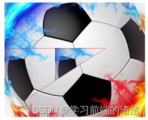
//将足球加入到屏幕上,足球是一个图片,位于路径“assets/soccer_ball.png”。首先我们需要将它放置在左下角接近边界处。
Image {
id: ball
x:20;y:240
width: 50
height: 50
rotation:0
source: "img/football.jpg"
//图片与鼠标区域连接,点击球将会重置球的状态,并且动画重新开始。
MouseArea{
anchors.fill: parent
onClicked: {
ball.x=20
ball.y=240
ball.rotation=0
anim.restart()
}
}
}
ParallelAnimation{
id:anim
//首先使用一个连续的动画来播放两次的y轴变换。
SequentialAnimation{
NumberAnimation{
target: ball
properties: 'y'
to:20
duration: root.duration*0.4
}
NumberAnimation{
target: ball
properties: 'y'
to:240
duration: root.duration*0.6
}
}
//添加x轴坐标转换。x轴坐标转换需要与y轴坐标转换同时进行
NumberAnimation{
target: ball
properties: 'x'
to:400
duration: root.duration
}
//最后想要旋转这个球,我们需要向平行动画中添加一个新的动画,选择RotationAnimation来实现旋转。
RotationAnimation{
target: ball
properties: "rotation"
to:720
duration: root.duration*1.1
}
}
}
qml动画6
9.2、状态与过渡
通常我们将用户界面描述为一种状态。一个状态定义了一组属性的改变,并且会在一定的条件下被触发。
在这些状态转化的过程中可以有一个过渡,定义了这些属性的动画或者一些附加的动作。当进入一个新的状态时,动作也可以被执行。
9.2.1、状态
在QML中,使用State元素来定义状态,需要与基础元素对象(Item)的states序列属性连接。状态通过它的状态名来鉴别,由组成它的一系列简单的属性来改变元素。默认的状态在初始化元素属性时定义,并命名为“”(一个空的字符串)。
import QtQuick 2.5

Item {

    id:root
    states: [
        State{

            name:"go"
            PropertyChanges {

                target: {
    ...}

            }
        },
        State{

            name:"stop"
            PropertyChanges {

                target: {
    ...}

            }
        }
    ]
}
状态的改变由分配一个元素新的状态属性名来完成。
另一种切换属性的方法是使用状态元素的when属性。when属性能够被设置为一个表达式的结果,当结果为true时,状态被使用。
Item {

    id: root
    states: [
    ...]
    Button{

        id:gotButton
        ...
        onClicked:root.state="go"
    }
}
例如一个交通信号灯有两个信号灯。上面的一个信号灯使用红色,下面的信号灯使用绿色。
import QtQuick 2.5

Item {

    id: root
    width: 200
    height: 500
    //    当系统启动时,它会自动切换到停止模式作为默认状态。初始化状态“”(空字符串)定义初始化属性,并且扮演类似“stop”状态的角色。
    state: "stop"

    states:[
        //        停止状态改变了light1为红色并且light2为黑色(关闭)。
        State{

            name:'stop'
            PropertyChanges {

                target: light1;color:"red"
            }
            PropertyChanges {

                target:light2;color:"black"
            }
        },
        //        在go状态下,我们改变颜色属性,light1变为黑色(关闭),light2变为绿色。
        State{

            name:'go'
            PropertyChanges {

                target: light1;color:"black"
            }
            PropertyChanges {

                target: light2;color:"green"

            }
        }
    ]

    Rectangle{

        id:light1
        x:25;y:25
        width: 100;height: 100
        radius: width/2
        color: "black"
    }
    Rectangle{

        id:light2
        x:25;y:150
        width: 100;height: 100
        radius: width/2
        color: "black"
    }
//    使用鼠标区域覆盖整个交通灯,并且绑定在点击时切换go和stop状态。
    MouseArea{

        anchors.fill: parent
        onClicked: parent.state=(parent.state=='stop'?'go':'stop')
    }
}
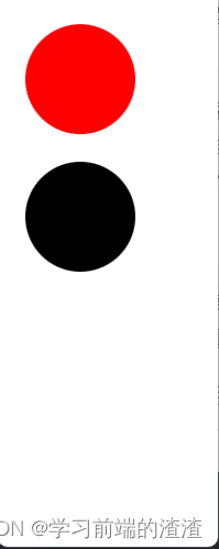
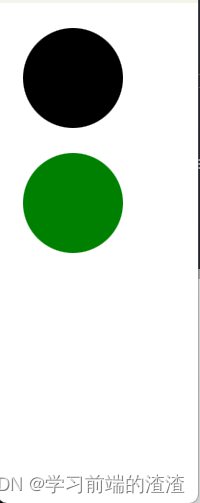
现在已经成功实现了交通灯的状态切换。为了让用户界面看起来更加自然,我们需要使用动画效果来增加一些过渡。一个过渡能够被状态的改变触发。
9.2.2、过渡
一系列的过渡能够被加入任何元素,一个过渡由状态的改变触发执行。
可以使用属性的from:和to:来定义状态改变的指定过渡。这两个属性就像一个过滤器,当过滤器为true时,过渡生效。
也可以使用“”来表示任何状态。例如from:”“; to:”*”表示从任一状态到另一个任一状态的默认值,这意味着过渡用于每个状态的切换。
transitions: [
        Transition {

            from: "stop"
            to: "go"

            ColorAnimation {

                target: light1
                properties: 'color'
                duration: 2000
            }
            ColorAnimation {

                target: light2
                properties: 'color'
                duration: 2000
            }
        }
    ]
qml动画7
10、模型-视图-代理
在QtQuick中,数据通过model-view(模型-视图)分离。对于每个view(视图),每个数据元素的可视化都分给一个代理(delegate)。
10.1、概念
对于开发用户界面,最重要的一方面是保持数据与可视化的分离。例如,一个电话薄可以使用一个垂直文本链表排列或者使用一个网格联系人图片排列。在这两个案例中,数据都是相同的,但是可视化效果却是不同的。这种方法通常被称作model-view(模型-视图)模式。在这种模式中,数据通常被称作model(模型),可视化处理称作view(视图)。
在QML中,model(模型)与view(视图)都通过delegate(代理)连接起来。功能划分如下,model(模型)提供数据。对于每个数据项,可能有多个值。
显示在view(视图)中的每项数据,都是通过delegate(代理)来实现可视化。view(视图)的任务是排列这些delegate(代理),每个delegate(代理)将model item(模型项)的值显示给用户。
10.2、基础模型
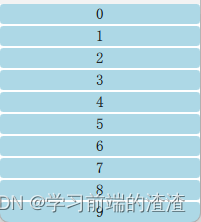
最基本的分离数据与显示的方法是使用Repeater元素。它被用于实例化一组元素项,并且很容易与一个用于填充用户界面的定位器相结合。
最基本的实现举例,repeater元素用于实现子元素的标号。每个子元素都拥有一个可以访问的属性index,用于区分不同的子元素。
import QtQuick 2.15

Column{

    spacing: 2
    Repeater{

        model: 10

        Rectangle{

            width: 200
            height: 20

            radius: 3
            color: "lightBlue"

            Text{

                anchors.centerIn: parent
                text: index
            }
        }
    }
}
一个repeater元素创建了10个子项,子项的数量由model属性控制。对于每个子项Rectangle包含了一个Text元素,将text属性设置为index的值,因此可以看到子项的编号是0~9。
有时我们想显示一些更复杂的数据。使用一个JavaScript序列来替换整形变量model的值可以达到我们的目的。序列可以使用任何类型的内容,可以是字符串,整数,或者对象。
import QtQuick 2.0
Column {

    spacing: 2
    Repeater {

        model: ["Enterprise", "Colombia", "Challenger", "Discovery", "Endeavour", "Atlantis"]
        Rectangle {

            width: 100
            height: 20
            radius: 3
            color: "lightBlue"
            Text {

                anchors.centerIn: parent
                text: index +": "+modelData
            }
        }
    }
}
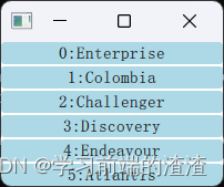
将数据暴露成一组序列,可以通过标号迅速的找到你需要的信息。一个链表模型由许多ListElement(链表元素)组成。在每个链表元素中,可以绑定值到属性上。
import QtQuick 2.5

Column{

    spacing: 2

    Repeater{

        model:ListModel{

            ListElement{
    name:"Mercury";surfaceColor:"gray"}
            ListElement {
     name: "Venus"; surfaceColor: "yellow" }
            ListElement {
     name: "Earth"; surfaceColor: "blue" }
            ListElement {
     name: "Mars"; surfaceColor: "orange" }
            ListElement {
     name: "Jupiter"; surfaceColor: "orange" }
            ListElement {
     name: "Saturn"; surfaceColor: "yellow" }
            ListElement {
     name: "Uranus"; surfaceColor: "lightBlue" }
            ListElement {
     name: "Neptune"; surfaceColor: "lightBlue" }
        }

        Rectangle{

            width: 200
            height: 50
            radius: 3
            color: "lightBlue"

            Text{

                anchors.centerIn: parent
                text: name
            }
            Rectangle{

                anchors.left: parent.left
                anchors.verticalCenter: parent.verticalCenter
                anchors.leftMargin: 2
                width: 16
                height: 16
                radius: 8
                border.color: "black"
                border.width: 1
                color: surfaceColor
            }
        }

    }
}
每个元素都提供了一个名字和一个颜色。每个元素中的属性绑定连接到repeater实例化的子项上。这意味着变量name和surfaceColor可以被repeater创建的每个Rectangle和Text项引用。这不仅可以方便的访问数据,也可以使源代码更加容易阅读。surfaceColor是名字左边圆的颜色,而不是模糊的数据序列列i或者行j。
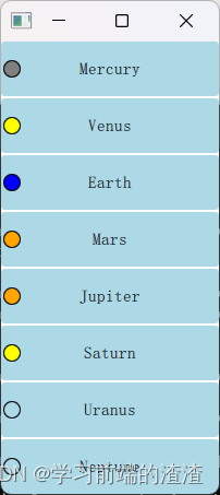
epeater的内容的每个子项实例化时绑定了默认的属性delegate(代理)。
10.3、动态视图
Repeater元素适合有限的静态数据。
ListView和GridView元素,这两个都是基于Flickable(可滑动)区域的元素,因此用户可以放入更大的数据。同时,它们限制了同时实例化的代理数量。对于一个大型的模型,这意味着在同一个场景下只会加载有限的元素。
10.3.1、链表视图ListView
ListView与Repeater元素像素,它使用了一个model,使用delegate来实例化,并且在两个delegate之间能够设置间隔sapcing。
import QtQuick 2.5

Rectangle{

    width: 200
    height: 800
    color: "white"
    ListView{

        anchors.fill: parent
        anchors.margins: 20

        clip: true
        model: 100
        delegate: numberDelegate
        spacing: 5

    }

    Component{

        id:numberDelegate

        Rectangle{

            width: 50
            height: 50
            color: "lightGreen"
            Text {

                anchors.centerIn: parent
                font.pixelSize: 10
                text: index
            }
        }
    }
}
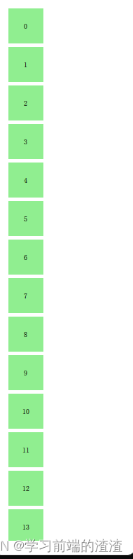
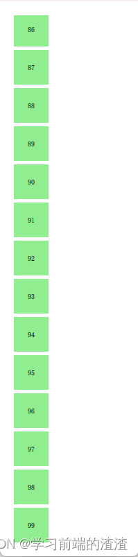
对于用户,ListView(列表视图)是一个滚动区域。它支持惯性滚动,这意味着它可以快速的翻阅内容。默认模式下,它可以在内容最后继续伸展,然后反弹回去,这个信号告诉用户已经到达内容的末尾。
视图末尾的行为是由到boundsBehavior属性的控制的。这是一个枚举值,并且可以配置为默认的Flickable.DragAndOvershootBounds,视图可以通过它的边界线来拖拽和翻阅,配置为Flickable.StopAtBounds,视图将不再可以移动到它的边界线之外。配置为Flickable.DragOverBounds,用户可以将视图拖拽到它的边界线外,但是在边界线上翻阅将无效。
使用snapMode属性可以限制一个视图内元素的停止位置。默认行为下是ListView.NoSnap,允许视图内元素在任何位置停止。将snapMode属性设置为ListView.SnapToItem,视图顶部将会与元素对象的顶部对齐排列。使用ListView.SnapOneItem,当鼠标或者触摸释放时,视图将会停止在第一个可见的元素,这种模式对于浏览页面非常便利。
10.3.2、方向
默认的链表视图只提供了一个垂直方向的滚动条,但是水平滚动条也是需要的。链表视图的方向由属性orientation控制。它能够被设置为默认值ListView.Vertical或者ListView.Horizontal。下面是一个水平链表视图。
import QtQuick 2.5

Rectangle{

    width: 1080
    height: 200
    color: "white"
    ListView{

        anchors.fill: parent
        anchors.margins: 20

        clip: true
        model: 100
        orientation: ListView.Horizontal
        delegate: numberDelegate
        spacing: 5

    }

    Component{

        id:numberDelegate

        Rectangle{

            width: 50
            height: 50
            color: "lightGreen"
            Text {

                anchors.centerIn: parent
                font.pixelSize: 10
                text: index
            }
        }
    }
}
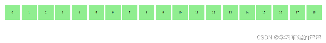
按照上面的设置,水平链表视图默认的元素顺序方向是由左到右。可以通过设置layoutDirection属性来控制元素顺序方向,它可以设置为Qt.LeftToRight或者Qt.RightToLeft。
layoutDirection: Qt.RightToLeft

10.3.3、键盘导航和高亮
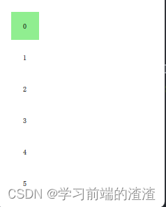
当使用基于触摸方式的链表视图时,默认提供的视图已经足够使用。在使用键盘甚至仅仅通过方向键选择一个元素的场景下,需要有标识当前选中元素的机制。在QML中,这被叫做高亮。
视图支持设置一个当前视图中显示代理元素中的高亮代理。它是一个附加的代理元素,这个元素仅仅只实例化一次,并移动到与当前元素相同的位置。
import QtQuick 2.5

Rectangle{

    width: 240
    height: 300
    color: "white"

    ListView{

        anchors.fill: parent
        anchors.margins: 20
        clip: true
        model: 100
        delegate: numberDelegate
        spacing: 5
        highlight: highlightComponent
        focus: true
    }

    Component{

        id:highlightComponent
        Rectangle{

//            ListView.view.width属性被绑定用于高亮元素的宽度。
            width: ListView.view.width
            color:"lightGreen"
        }
    }
    Component{

        id:numberDelegate
        Item{

            width: 40
            height: 40
            Text {

                anchors.centerIn: parent
                font.pixelSize: 10

                text: index
            }
        }
    }
}
首先是focus属性设置为true,它设置链表视图能够获得键盘焦点。然后是highlight属性,指出使用的高亮代理元素。高亮代理元素的x,y与height属性由当前元素指定。如果宽度没有特别指定,当前元素的宽度也可以用于高亮代理元素。
ListView.view.width属性被绑定用于高亮元素的宽度。
当使用高亮与链表视图(ListView)结合时,一些属性可以用来控制它的行为。highlightRangeMode控制了高亮如何影响视图中当前的显示。默认设置ListView.NoHighLighRange意味着高亮与视图中的元素距离不相关。
ListView.StrictlyEnforceRnage确保了高亮始终可见,如果某个动作尝试将高亮移出当前视图可见范围,当前元素将会自动切换,确保了高亮始终可见。
ListView.ApplyRange,它尝试保持高亮代理始终可见,但是不会强制切换当前元素始终可见。如果在需要的情况下高亮代理允许被移出当前视图。
在默认配置下,视图负责高亮移动到指定位置,移动的速度与大小的改变能够被控制,使用一个速度值或者一个动作持续时间来完成它。这些属性包括highlightMoveSpeed,highlightMoveDuration,highlightResizeSpeed和highlightResizeDuration。默认下速度被设置为每秒400像素,动作持续时间为-1,表明速度和距离控制了动作的持续时间。如果速度与动作持续时间都被设置,动画将会采用速度较快的结果来完成。
为了更加详细的控制高亮的移动,highlightFollowCurrentItem属性设置为false。这意味着视图将不再负责高亮代理的移动。取而代之可以通过一个行为(Bahavior)或者一个动画来控制它。
import QtQuick 2.5

Rectangle{

    width: 240
    height: 300
    color: "white"

    ListView{

        anchors.fill: parent
        anchors.margins: 20
        clip: true
        model: 100
        delegate: numberDelegate
        spacing: 5
        highlight: highlightComponent
        focus: true
    }

    Component{

        id:highlightComponent
        Item{

//            ListView.view.width属性被绑定用于高亮元素的宽度。
            width: ListView.view.width
            height: ListView.view.currentItem.height
            y:ListView.view.currentItem.y
            Behavior on y{

                SequentialAnimation{

                    PropertyAnimation{

                        target: highlightRectangle;property: "opacity";to:0;duration: 200
                    }
                    NumberAnimation{

                        duration: 1
                    }
                    PropertyAnimation{

                        target: highlightRectangle;property :"opacity";to:1;duration: 200
                    }
                }
            }
            Rectangle{

                id:highlightRectangle
                anchors.fill: parent
                color:'lightGreen'
            }

        }
    }
    Component{

        id:numberDelegate
        Item{

            width: 40
            height: 40
            Text {

                anchors.centerIn: parent
                font.pixelSize: 10

                text: index
            }
        }
    }
}
高亮代理的y坐标属性与ListView.view.currentItem.y属性绑定。这确保了高亮始终跟随当前元素。然而,由于我们没有让视图来移动这个高亮代理,我们需要控制这个元素如何移动,通过Behavior on y来完成这个操作,在下面的例子中,移动分为三步完成:淡出,移动,淡入。注意怎样使用SequentialAnimation和PropertyAnimation元素与NumberAnimation结合创建更加复杂的移动效果。
qml动画8
10.3.4、页眉与页脚
我们能够向链表视图中插入一个页眉(header)元素和一个页脚(footer)元素。这部分是链表的开始或者结尾处被作为代理元素特殊的区域。对于一个水平链表视图,不会存在页眉或者页脚,但是也有开始和结尾处,这取决于layoutDirection的设置。
import QtQuick 2.5

Rectangle{

    width: 400
    height: 600
    color: "white"
    ListView{

        anchors.fill: parent
        anchors.margins: 20
        clip: true
        model: 4
        delegate: numberDelegate
        spacing: 5
        header: headerComponent
        footer: footerComponent
    }
    Component{

        id:numberDelegate
        Rectangle{

            width: 200
            height: 50
            color: "lightGreen"
            Text{

                anchors.centerIn: parent
                font.pixelSize: 10
                text:index
            }
        }
    }
    Component{

        id:headerComponent
        Rectangle{

            width: 200
            height: 20
            color: "yellow"
        }
    }
    Component{

        id:footerComponent
        Rectangle{

            width: 200
            height: 20
            color: "red"
        }
    }
}
页眉与页脚代理元素不遵循链表视图(ListView)的间隔(spacing)属性,它们被直接放在相邻的链表元素之上或之下。这意味着页眉与页脚的间隔必须通过页眉与页脚元素自己设置。
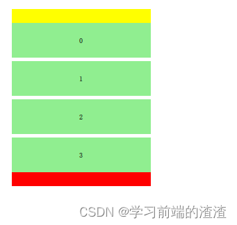
10.3.5、网格视图GridView
使用网格视图(GridView)与使用链表视图(ListView)的方式非常类似。真正不同的地方是网格视图(GridView)使用了一个二维数组来存放元素,而链表视图(ListView)是使用的线性链表来存放元素。
import QtQuick 2.5

Rectangle{

    width: 600
    height: 600
    color: "white"
    GridView{

        anchors.fill: parent
        anchors.margins: 20
        clip: true
        model: 100
        cellHeight: 40
        cellWidth: 40
        delegate: numberDelegate
    }

    Component{

        id:numberDelegate
        Rectangle{

            width: 40
            height: 40
            color: "lightGreen"
            Text{

                anchors.centerIn: parent
                font.pixelSize: 10
                text:index
            }
        }
    }
}
与链表视图(ListView)比较,网格视图(GridView)不依赖于元素间隔和大小来配置元素。它使用单元宽度(cellWidth)与单元高度(cellHeight)属性来控制数组内的二维元素的内容。每个元素从左上角开始依次放入单元格。
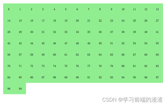
一个网格视图(GridView)也包含了页脚与页眉,也可以使用高亮代理并且支持捕捉模式(snap mode)的多种反弹行为。它也可以使用不同的方向(orientations)与定向(directions)来定位。
定向使用flow属性来控制。它可以被设置为GridView.LeftToRight或者GridView.TopToBottom。模型的值从左往右向网格中填充,行添加是从上往下。视图使用一个垂直方向的滚动条。后面添加的元素也是由上到下,由左到右。
此外还有flow属性和layoutDirection属性,能够适配网格从左到右或者从右到左,这依赖于你使用的设置值。
10.4、代理
10.4.1、代理Delegate
使用模型与视图来自定义用户界面时,代理在创建显示时扮演了大量的角色。在模型中的每个元素通过代理来实现可视化,用户真实可见的是这些代理元素。
每个代理访问到索引号或者绑定的属性,一些是来自数据模型,一些来自视图。来自模型的数据将会通过属性传递到代理。来自视图的数据将会通过属性传递视图中与代理相关的状态信息。
通常使用的视图绑定属性是ListView.isCurrentItem和ListView.view。
- ListView.isCurrentItem:
布尔值,标识这个元素是否是视图当前元素,这个值是只读的,引用自当前视图。通过访问视图,可以创建可复用的代理,这些代理在被包含时会自动匹配视图的大小。
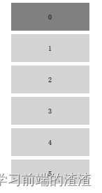
import QtQuick 2.0

Rectangle{

    width: 120
    height: 300
    color: "white"
    ListView{

        anchors.fill: parent
        anchors.margins: 20
        clip: true
        model: 100
        delegate: numberDelegate
        spacing: 5
        focus: true
    }
    Component{

        id:numberDelegate
        Rectangle{

            width: ListView.view.width
            height: 40
            color: ListView.isCurrentItem?'gray':'lightGray'
            Text {

                anchors.centerIn: parent
                font.pixelSize: 10
                text: index
            }
        }
    }
}
上面例子中,每个代理的width(宽度)属性与视图的width(宽度)属性绑定,每个代理的背景颜色color依赖于绑定的属性ListView.isCurrentItem属性。
如果在模型中的每个元素与一个动作相关,例如点击作用于一个元素时,这个功能是代理完成的。这是由事件管理分配给视图的,这个操作控制了视图中元素的导航,代理控制了特定元素上的动作。
最基础的方法是在每个代理中创建一个MouseArea(鼠标区域)并且响应onClicked信号。
10.4.2、动画添加与移除元素
在某些情况下,视图中的显示内容会随着时间而改变。由于模型数据的改变,元素会添加或者移除。在这些情况下,一个比较好的做法是使用可视化队列给用户一个方向的感觉来帮助用户知道哪些数据被加入或者移除。
为了方便使用,QML视图为每个代理绑定了两个信号,onAdd和onRemove。使用动画连接它们,可以方便创建识别哪些内容被添加或删除的动画。
例子:
有一个添加新元素的按钮。当点击它时,会调用模型的append方法来添加一个新的元素。这个操作会触发视图创建一个新的代理,并发送GridView.onAdd信号。SequentialAnimation队列动画与这个信号连接绑定,使用代理的scale属性来放大视图元素。
当视图中的一个代理点击时,将会调用模型的remove方法将一个元素从模型中移除。这个操作将会导致GridView.onRemove信号的发送,触发另一个SequentialAnimation。这时,代理的销毁将会延迟直到动画完成。为了完成这个操作,PropertyAction元素需要在动画前设置GridView.delayRemove属性为true,并在动画后设置为false。这样确保了动画在代理项移除前完成。
import QtQuick 2.5

Rectangle{

    width: 1000
    height: 300

    color: "white"
    ListModel{

        id:theModel
        ListElement{
    number:0}
        ListElement{
    number:1}
        ListElement{
    number:2}
        ListElement{
    number:3}
        ListElement{
    number:4}
        ListElement{
    number:5}
        ListElement{
    number:6}
        ListElement{
    number:7}
        ListElement{
    number:8}
        ListElement{
    number:9}
    }
    Rectangle{

        anchors.left: parent.left
        anchors.right: parent.right
        anchors.bottom: parent.bottom
        anchors.margins: 20
        height: 40
        color: "darkGreen"
        Text {

            anchors.centerIn: parent
            text: 'Add item'
        }
        MouseArea{

            anchors.fill: parent
            onClicked: {

                theModel.append({
    "number":++parent.count})
            }
        }
        property int count: 9
    }
    GridView{

        anchors.fill: parent
        anchors.margins: 20
        anchors.bottomMargin: 80
        clip: true
        model: theModel
        cellWidth: 60
        cellHeight: 45
        delegate: numberDelegate
    }

    Component{

        id:numberDelegate
        Rectangle{

            id:wrapper
            width: 55
            height: 55
            color: "lightGreen"
            Text {

                anchors.centerIn: parent
                font.pixelSize: 10
                text: number
            }
            MouseArea{

                anchors.fill: parent
                onClicked: {

                    if(!wrapper.GridView.delayRemove)
                        theModel.remove(index)
                }
            }
            GridView.onRemove:SequentialAnimation{

                PropertyAction {
     target: wrapper; property: "GridView.delayRemove"; value: true }
                NumberAnimation {
     target: wrapper; property: "scale"; to: 0; duration: 250; easing.type: Easing.InOutQuad }
                PropertyAction {
     target: wrapper; property: "GridView.delayRemove"; value: false }
            }
            GridView.onAdd: SequentialAnimation {

                NumberAnimation {
     target: wrapper; property: "scale"; from: 0; to: 1; duration: 250; easing.type: Easing.InOutQuad }
            }
        }
    }
}
qml动画9
10.4.3、形变的代理
在使用链表时通常会使用当前项激活时展开的机制。这个操作可以被用于动态的将当前项目填充到整个屏幕来添加一个新的用户界面,或者为链表中的当前项提供更多的信息。
例子
当点击链表项时,链表项都会展开填充整个链表视图(ListView)。额外的间隔区域被用于添加更多的信息,这种机制使用一个状态来控制,当一个链表项展开时,代理项都能输入expanded(展开)状态,在这种状态下一些属性被改变。
import QtQuick 2.5

Item {


    width: 800
    height: 900
    ListView{

        id:listView
        anchors.fill: parent
        delegate: detailsDelegate
        model: planets
    }

    ListModel{

        id:planets
        ListElement {
     name: "Mercury";colorBG:'green'; imageSource: "img/1.png"; facts: "Mercury is the smallest planet in the Solar System. It is the closest planet to the sun. It makes one trip around the Sun once every 87.969 days." }
        ListElement {
     name: "Venus";colorBG:'blue';  imageSource: "img/beijing.jpg"; facts: "Venus is the second planet from the Sun. It is a terrestrial planet because it has a solid, rocky surface. The other terrestrial planets are Mercury, Earth and Mars. Astronomers have known Venus for thousands of years." }
        ListElement {
     name: "Earth";colorBG:'pink';  imageSource: "img/jinyan.png"; facts: "The Earth is the third planet from the Sun. It is one of the four terrestrial planets in our Solar System. This means most of its mass is solid. The other three are Mercury, Venus and Mars. The Earth is also called the Blue Planet, 'Planet Earth', and 'Terra'." }
        ListElement {
     name: "Mars";colorBG:'yellow'; imageSource: "img/football.png"; facts: "Mars is the fourth planet from the Sun in the Solar System. Mars is dry, rocky and cold. It is home to the largest volcano in the Solar System. Mars is named after the mythological Roman god of war because it is a red planet, which signifies the colour of blood." }

    }
    Component{

        id:detailsDelegate
        Item{

            id:wrapper
            width: listView.width
            height: 100
            Rectangle{

                anchors.left: parent.left
                anchors.right: parent.right
                anchors.top: parent.top
                height: 100
                color: colorBG
                Text{

                    anchors.left: parent.left
                    anchors.verticalCenter: parent.verticalCenter
                    font.pixelSize: parent.height-4
                    text: name
                }
            }

            Rectangle{

                id:img
                color: "black"
                anchors.right: parent.right
                anchors.top: parent.top
                anchors.rightMargin: 2
                anchors.topMargin: 2
                width: 80
                height: 80
                Image{

                    anchors.fill: parent
                    fillMode: Image.PreserveAspectFit
                    source: imageSource
                }
            }

            MouseArea{

                anchors.fill: parent
                onClicked:{

                    parent.state="expanded"
                }
            }

            Item{

                id:factsView
                anchors.top: img.bottom
                anchors.left: parent.left
                anchors.right: parent.right
                anchors.bottom: parent.bottom

                opacity: 0

                Rectangle{

                    anchors.fill: parent
                    color: "#cccccc"

                    Text {

                        anchors.fill: parent
                        anchors.margins: 5
                        clip: true
                        wrapMode: Text.WordWrap
                        font.pixelSize: 12
                        text: facts
                    }
                }
            }

//           左上角红色关闭按钮
            Rectangle{

                id:closeButton
                anchors.right: parent.right
                anchors.top: parent.top
                anchors.rightMargin:  2
                anchors.topMargin: 2

                width: 80
                height: 80

                color: "red"

                opacity: 0

                MouseArea{

                    anchors.fill: parent
                    onClicked: wrapper.state=""
                }
            }

//            状态变化
            states: [

                State{

                    name:"expanded"
//                    1、包装器(wrapper)的高度(height)被设置为链表视图(ListView)的高度。
                    PropertyChanges {
    target: wrapper;height:listView.height}
//                    2、标签图片被放大并且下移,使图片从小图片的位置移向大图片的位置
                    PropertyChanges {
     target: img; width: listView.width; height: listView.width; anchors.rightMargin: 0; anchors.topMargin: 30 }
//                    3、显示实际视图
                    PropertyChanges {
     target: factsView; opacity: 1 }
//                    4、显示关闭按钮
                    PropertyChanges {
     target: closeButton; opacity: 1 }
//                    5、设置链表视图(contentsY:视图顶部可见的部分代理的Y轴坐标;设置视图的交互(interactive)为false。这个操作阻止了视图的移动,用户不再能够通过滚动条切换当前项。)
                    PropertyChanges {
     target: wrapper.ListView.view; contentY: wrapper.y; interactive: false }
                }

            ]
//            动画过渡

            transitions: [

                Transition {

                    NumberAnimation{

                        duration: 200;
                        properties: "height,width,anchors.rightMargin,anchors.topMargin,opacity,contentY"
                    }

                }
            ]
        }

    }
}
首先,包装器(wrapper)的高度(height)被设置为链表视图(ListView)的高度。标签图片被放大并且下移,使图片从小图片的位置移向大图片的位置。除了这些之外,两个隐藏项,实际视图(factsView)与关闭按键(closeButton)切换它的opactiy(透明度)显示出来。最后设置链表视图(ListView)。
设置链表视图(ListView)包含了设置内容Y坐标(contentsY),这是视图顶部可见的部分代理的Y轴坐标。另一个变化是设置视图的交互(interactive)为false。这个操作阻止了视图的移动,用户不再能够通过滚动条切换当前项。
由于设置第一个链表项为可点击,向它输入一个expanded(展开)状态,导致了它的代理项被填充到整个链表并且内容重置。当点击关闭按钮时,清空状态,导致它的代理项返回上一个状态,并且重新设置链表视图(ListView)有效。
形变的代理
10.5、高级用法
10.5.1、路径视图
路径视图(PathView)非常强大,但也非常复杂,这个视图由QtQuick提供。它创建了一个可以让子项沿着任意路径移动的视图。沿着相同的路径,使用缩放(scale),透明(opacity)等元素可以更加详细的控制过程。
当使用路径视图(PathView)时,你必须定义一个代理和一个路径。路径视图(PathView)本身也可以自定义一些属性的区间。通常会使用:
- pathItemCount属性,它控制了一次可见的子项总数。
- preferredHighLightBegin属性控制了高亮区间,
- preferredHighlightEnd与highlightRangeMode,控制了当前项怎样沿着路径显示。
路径(path)属性使用一个路径(path)元素来定义路径视图(PathView)内代理的滚动路径。路径使用startx与starty属性来链接路径(path)元素,例如PathLine,PathQuad和PathCubic。这些元素都使用二维数组来构造路径。
当路径定义好之后,可以使用PathPercent和PathAttribute元素来进一步设置。它们被放置在路径元素之间,并且为经过它们的路径和代理提供更加细致的控制。PathPercent提供了如何控制每个元素之间覆盖区域部分的路径,然后反过来控制分布在这条路径上的代理元素,它们被按比例的分布播放。
preferredHightlightBegin与preferredHighlightEnd属性由PathView(路径视图)输入到图片元素中。它们的值在0~1之间。结束值大于等于开始值。例如设置这些属性值为0.5,当前项只会显示当前百分之50的图像在这个路径上。
在Path中,PathAttribute元素也是被放置在元素之间的,就像PathPercent元素。它们可以让你指定属性的值然后插入的路径中去。这些属性与代理绑定可以用来控制任意的属性。
import QtQuick 2.5

Item{

    id:root
    width: 500
    height: 500
    PathView{

        anchors.fill: parent
        delegate: flipCardDelegate

        model: 100
        path:Path{

            startX: root.width/2
            startY: 0

            PathAttribute{
    name:"itemZ";value:0}
            PathAttribute{
    name:"itemAngle";value:-90.0}
            PathAttribute{
    name:"itemScale";value:0.5}
            PathLine{
    x:root.width/2;y:root.height*0.4}
            PathPercent{
    value:0.48}
            PathLine{
    x:root.width/2;y:root.height*0.5}
            PathAttribute{
    name:"itemAngle";value:0.0}
            PathAttribute {
     name: "itemScale"; value: 1.0; }
            PathAttribute {
     name: "itemZ"; value: 100 }
            PathLine {
     x: root.width/2; y: root.height*0.6; }
            PathPercent {
     value: 0.52; }
            PathLine {
     x: root.width/2; y: root.height; }
            PathAttribute {
     name: "itemAngle"; value: 90.0; }
            PathAttribute {
     name: "itemScale"; value: 0.5; }
            PathAttribute {
     name: "itemZ"; value: 0 }
        }
        pathItemCount: 16

        preferredHighlightBegin: 0.5
        preferredHighlightEnd: 0.5
    }
//    代理如下面所示,使用了一些从PathAttribute中链接的属性,itemZ,itemAngle和itemScale。需要注意代理链接的属性只在wrapper中可用。因此,rotxs属性在Rotation元素中定义为可访问值。

//    另一个需要注意的是路径视图(PathView)链接的PathView.onPath属性的用法。通常对于这个属性都绑定为可见,这样允许路径视图(PathView)缓冲不可见的元素。这不是通过剪裁处理来实现的,因为路径视图(PathView)的代理比其它的视图,例如链表视图(ListView)或者栅格视图(GridView)放置更加随意。

    Component{

        id:flipCardDelegate
        Item{

            id:wrapper
            width: 64
            height: 64
            visible: PathView.onPath

            scale: PathView.itemScale
            z:PathView.itemZ

            property var rotX: PathView.itemAngle
            transform: Rotation{
    axis: {
    x:1;y:0;z:0} angle:wrapper.rotX;origin {
    x:32;y:32}}

            Rectangle{

                anchors.fill: parent
                color: "lightGray"
                border.color: "black"
                border.width: 3
            }
           Text {

                anchors.centerIn: parent
                text:index
                font.pixelSize: 30
            }
        }
    }
}
上面这个例子展示了路径视图(PathView)如何创建一个卡片视图,并且用户可以滑动它。我们使用了一些技巧来完成这个例子。路径由PathLine元素组成。使用PathPercent元素,它确保了中间的元素居中,并且给其它的元素提供了足够的空间。使用PathAttribute元素来控制旋转,大小和深度值(z-value)。
在这个路径之上(path),需要设置路径视图(PathView)的pathItemCount属性。它控制了路径的浓密度。路径视图的路径(PathView.onPath)使用preferredHighlightBegin与preferredHighlightEnd来控制可见的代理项。
路径视图
10.5.2、XML模型
XML是一种常见的数据格式。QML提供了XmlListModel元素来包装XML数据。这个元素能够获取本地或者网络上的XML数据,然后通过XPath解析这些数据。
import QtQuick 2.0
import QtQuick.XmlListModel 2.0

Item {

    width: 300
    height: 480

    Component{

        id:imageDelegate

        Item {

            width: ListView.width
            height: 400

            Column{

                Text {

                    text: title
                }
                Image {


                    source: imageSource
                }
            }
        }
    }

    XmlListModel {

        id:imageModel
        source: "http://feeds.nationalgeographic.com/ng/photography/photo-of-the-day/"
        query: "/rss/channel/item"
        XmlRole{
    name:"title";query:"title/string()"}
        XmlRole{
    name:"imageSource";query:"substring-before(substring-after(description/string(), 'img src=\"'), '\"')" }
    }

    ListView{

        id:listView
        anchors.fill: parent
        model:imageModel
        delegate: imageDelegate
    }

}
当数据下载完成后,它会被加工作为模型的子项。查询属性(query)是一个XPath代理的基础查询,用来创建模型项。在这个例子中,这个路径是/rss/channel/item,所以,在一个模型子项创建后,每一个子项的标签,都包含了一个频道标签,包含一个RSS标签。
每一个模型项,一些规则需要被提取,由XmlRole元素来代理。每一个规则都需要一个名称,这样代理才能够通过属性绑定来访问。每个这样的属性的值都通过XPath查询来确定。例如标题属性(title)符合title/string()查询,返回内容中在之间的值。
图像源属性(imageSource)更加有趣,因为它不仅仅是从XML中提取字符串,也需要加载它。在流数据的支持下,每个子项包含了一个图片。使用XPath的函数substring-after与substring-before,可以提取本地的图片资源。这样imageSource属性就可以直接被作为一个Image元素的source属性使用。
10.5.3、链表分段
有时,链表的数据需要划分段。例如使用首字母来划分联系人,或者音乐。使用链表视图可以把平面列表按类别划分。
import QtQuick 2.5


Rectangle{

    width: 500
    height: 400
    color: "white"
    ListView{

        anchors.fill: parent
        anchors.margins: 20
        clip:true
        model:spaceMen
        delegate:spaceManDelegate
        //定义了哪些属性用于内容的划分
        section.property: "nation"
        // section.delegate可以给段指定代理组件。它能够创建段标题,并且可以在任意子项之前插入这个段代理。
        section.delegate: sectionDelegate
    }

    Component{

        id:spaceManDelegate
        Item{

            width: 260
            height: 20
            Text{

                anchors.left: parent.left
                anchors.verticalCenter: parent.verticalCenter
                anchors.leftMargin: 10
                font.pixelSize: 12
                text: name
            }
        }
    }
    Component{

        id:sectionDelegate
        Rectangle{

            width: 260
            height: 20
            color: "lightBlue"
            Text{

                anchors.centerIn: parent
                anchors.verticalCenter:parent.verticalCenter
                anchors.leftMargin:10
                font.pixelSize:12
                font.bold:trie
                text:section
            }
        }
    }
    ListModel{

        id:spaceMen
        ListElement {
     name: "Abdul Ahad Mohmand"; nation: "Afganistan"; }
        ListElement {
     name: "Marcos Pontes"; nation: "Brazil"; }
        ListElement {
     name: "Alexandar Panayotov Alexandrov"; nation: "Bulgaria"; }
        ListElement {
     name: "Georgi Ivanov"; nation: "Bulgaria"; }
        ListElement {
     name: "Roberta Bondar"; nation: "Canada"; }
        ListElement {
     name: "Marc Garneau"; nation: "Canada"; }
        ListElement {
     name: "Chris Hadfield"; nation: "Canada"; }
        ListElement {
     name: "Guy Laliberte"; nation: "Canada"; }
        ListElement {
     name: "Steven MacLean"; nation: "Canada"; }
        ListElement {
     name: "Julie Payette"; nation: "Canada"; }
        ListElement {
     name: "Robert Thirsk"; nation: "Canada"; }
        ListElement {
     name: "Bjarni Tryggvason"; nation: "Canada"; }
        ListElement {
     name: "Dafydd Williams"; nation: "Canada"; }
    }
}
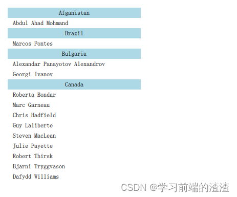
为了使用分段,section.property与section.criteria必须安装。section.property定义了哪些属性用于内容的划分。在这里,最重要的是知道每一段由哪些连续的元素构成,否则相同的属性名可能出现在几个不同的地方。
section.criteria能够被设置为ViewSection.FullString或者ViewSection.FirstCharacter。默认下使用第一个值,能够被用于模型中有清晰的分段,例如音乐专辑。第二个是使用一个属性的首字母来分段,这说明任何属性都可以被使用。通常的例子是用于联系人名单的姓。
当段被定义好后,每个子项能够使用绑定属性ListView.section,ListView.previousSection与ListView.nextSection来访问。使用这些属性,可以检测段的第一个与最后一个子项。
使用链表视图(ListView)的section.delegate属性可以给段指定代理组件。它能够创建段标题,并且可以在任意子项之前插入这个段代理。使用绑定属性section可以访问当前段的名称。
11、画布元素
画布元素(canvas element)的基本思想是使用一个2D对象来渲染路径。这个2D对象包括了必要的绘图函数,画布元素(canvas element)充当绘制画布。2D对象支持画笔,填充,渐变,文本和绘制路径创建命令。
import QtQuick 2.5

Canvas{

    id:root
    width: 200
    height: 200
    onPaint: {

        var ctx=getContext("2d")
        ctx.lineWidth=4
        ctx.strokeStyle="blue"
        ctx.fillStyle="steelblue"
        ctx.beginPath()
        ctx.moveTo(50,50)
        ctx.lineTo(150,50)
        ctx.lineTo(150,150)
        ctx.lineTo(50,150)
        ctx.closePath()
        ctx.fill()
        ctx.stroke()

    }
}
产生了一个在坐标(50,50),高宽为100的填充矩形框,并且使用了画笔来修饰边界。
典型绘制命令调用如下:
- 装载画笔或者填充模式
- 创建绘制路径
- 使用画笔或者填充绘制路径
11.1、便捷的接口
在绘制矩形时,我们提供了一个便捷的接口,而不需要调用stroke或者fill来完成。
import QtQuick 2.5

Canvas{

    id:root
    width: 120;height: 120
    onPaint: {

        var ctx=getContext("2d")
        ctx.fillStyle="green"
        ctx.strokeStyle="blue"
        ctx.lineWidth=4
        //x起点,y起点,宽度,高度
        ctx.fillRect(20,20,80,80)
        ctx.clearRect(30,30,60,60)
        ctx.strokeRect(20,20,40,40)
    }
}
画笔的绘制区域由中间向两边延展。一个宽度为4像素的画笔将会在绘制路径的里面绘制2个像素,外面绘制2个像素。
11.2、渐变
画布中可以使用颜色填充也可以使用渐变或者图像来填充。
import QtQuick 2.5

Rectangle{

    width: 500
    height: 500
    color: "red"
    Canvas{

        id:root
        anchors.fill: parent
        onPaint: {

            var ctx=getContext("2d")
            var gradient=ctx.createLinearGradient(100,0,100,200)
            //渐变色在停止点定义一个颜色,范围从0.0到1.0
            gradient.addColorStop(0,"blue")
            gradient.addColorStop(0.5,"lightsteelblue")
            ctx.fillStyle=gradient
            //x起点,y起点,宽度,高度
            ctx.fillRect(20,50,150,200)
        }
    }

}
渐变色是在画布坐标下定义的,而不是在绘制路径相对坐标下定义的。画布中没有相对坐标的概念。
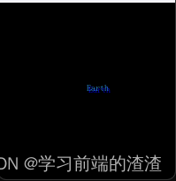
10.3、阴影
import QtQuick 2.5


Canvas{

    id:root
    width: 200
    height: 200
    onPaint: {

        var ctx=getContext("2d")
        //绘制黑色背景:
        ctx.strokeStyle ="#333"
        ctx.fillRect(0,0,root.width,root.height)
        //阴影配置
        ctx.shadowColor ="blue"
        //阴影X轴偏移值
        ctx.shadowOffsetX =2
        //阴影Y轴偏移值
        ctx.shadowOffsetY =2
        ctx.font="Bold 80px Ubuntu"
        ctx.fillStyle="#33a9ff"
        //绘制文本"Earth",以及文本显示的位置
        ctx.fillText("Earth",100,100)
    }
}
10.4、图片
import QtQuick 2.5


Canvas{

    id:root
    height: 1000
    width: 900

    onPaint: {

        var ctx=getContext("2d")
        ctx.drawImage("img/ftb.png",10,10)
        ctx.save()
        ctx.strokeStyle = 'red'
        ctx.beginPath()
        ctx.moveTo(10,100)
        ctx.lineTo(210,100)
        ctx.lineTo(55,200)
//      裁剪需要定义一个裁剪路径,然后调用clip()函数来实现裁剪。
        ctx.closePath()
        ctx.translate(100,0)
        ctx.clip()
        ctx.drawImage("img/ftb.png",10,10)
        ctx.stroke()
        ctx.restore()
    }

    Component.onCompleted: {

        loadImage("img/ftb.png")
    }
}
10.5、转换
画布有多种方式来转换坐标系。可以通过缩放(scale),旋转(rotate),translate(移动)来转换坐标系。与QML元素的转换不同的是,转换原点通常就是画布原点。
import QtQuick 2.5

Canvas{

    id:root
    width: 500
    height: 400
    onPaint: {

        var ctx=getContext("2d")
        ctx.strokeStyle ="blue"
        ctx.lineWidth=4

        ctx.beginPath()
        ctx.rect(150,150,50,50)
        ctx.translate(120,60)
        ctx.stroke()

        ctx.strokeStyle ="green"
        ctx.rotate(Math.PI/4)
        ctx.stroke()
    }
}
画布-转换
10.6、组合模式
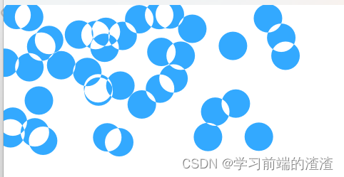
组合允许绘制一个形状然后与已有的像素点集合混合。画布提供了多种组合模式,使用globalCompositeOperation(mode)来设置。
- “source-over”
- source-in”
- source-out”
- “source-atop”
import QtQuick 2.5

Canvas{

    id:root
    width: 500
    height: 400
    onPaint: {

        var ctx=getContext("2d")
        ctx.globalCompositeOperation="xor"
        ctx.fillStyle="#33a9ff"
        for(var i=0;i<40;i++){

            ctx.beginPath()
            ctx.arc(Math.random()*400, Math.random()*200, 20, 0, 2*Math.PI)
            ctx.closePath()
            ctx.fill()
        }
    }
}
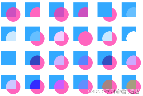
import QtQuick 2.5

Canvas{

    id:root
    width: 600
    height: 400
    property var operation: ['source-over', 'source-in', 'source-over',
        'source-atop', 'destination-over', 'destination-in',
        'destination-out', 'destination-atop', 'lighter',
        'copy', 'xor', 'qt-clear', 'qt-destination',
        'qt-multiply', 'qt-screen', 'qt-overlay', 'qt-darken',
        'qt-lighten', 'qt-color-dodge', 'qt-color-burn',
        'qt-hard-light', 'qt-soft-light', 'qt-difference',
        'qt-exclusion']

    onPaint: {

        var ctx=getContext("2d")

        for(var i=0; i<operation.length; i++) {

            var dx = Math.floor(i%6)*100
            var dy = Math.floor(i/6)*100
            ctx.save()
            ctx.fillStyle = '#33a9ff'
            ctx.fillRect(10+dx,10+dy,60,60)
            // TODO: does not work yet
            ctx.globalCompositeOperation = root.operation[i]
            ctx.fillStyle = '#ff33a9'
            ctx.globalAlpha = 0.75
            ctx.beginPath()
            ctx.arc(60+dx, 60+dy, 30, 0, 2*Math.PI)
            ctx.closePath()
            ctx.fill()
            ctx.restore()
        }
    }
}
遍历了列表中的组合模式,使用对应的组合模式生成了一个矩形与圆形的组合。
10.7、像素缓冲
import QtQuick 2.5

Rectangle{

    width: 500
    height: 300
    Canvas{

        id:canvas
        x:10
        y:10
        width: 100
        height: 100
        property real hue: 0.0
        onPaint: {

            var ctx=getContext("2d")
            var x=10+Math.random(80)*80
            var y=10+Math.random(80)*80
            hue+=Math.random()*0.1
            if(hue>1.0)(hue-=1)
            ctx.globalAlpha=0.7
            ctx.fillStyle=Qt.hsla(hue,0.5,0.5,1.0)
            ctx.beginPath()
            ctx.moveTo(x+5,y)
            ctx.arc(x,y,x/10,0,360)
            ctx.closePath()
            ctx.fill()
        }

        MouseArea{

            anchors.fill: parent
            onClicked: {

                var url=canvas.toDataURL("image/png")
                print("image url=",url)
                image.source =url
            }
        }
        Image {

            id: image
            x:130
            y:10
            width: 100
            height: 100
        }
        Timer{

            interval: 1000
            running: true
            triggeredOnStart: true
            repeat: true
            onTriggered: canvas.requestPaint()
        }
    }
}
智能推荐
android studioapp成功图,AndroidStudio多渠道打包当你完成了一个app项目,后面发现不同客户需要定制不同ui,或者功能,这个时候怎么办? 拿ui来说,第一种方法,不同客户替...-程序员宅基地
文章浏览阅读223次。最近不断有朋友向我咨询AndroidStudio多渠道的打包方法,今天整理一下之前积累的打包套路,写一篇文章,手把手的教给大家。 说到多渠道,这里不得不提一下友盟统计,友盟统计是大家日常开发中常用的渠道统计工具,而我们的打包方法就是基于友盟统计实施的。按照友盟官方文档说明,渠道信息通常需要在AndroidManifest.xml中配置如下值:上面的value值Channel_ID就是..._android studio多渠道res
python 使用HTMLReport生成测试报告-程序员宅基地
文章浏览阅读8.3k次。一、安装: 在线安装:使用pip命令安装HTMLReport 命令:pip install HTMLReport 安装好的位置在:Python安装路径下的Lib/site-packages下 离线安装:直接将下载好的HTMLR..._htmlreport
前端实现打印预览功能以及page-break-inside属性解决打印换行问题(打印预览表格或文字被分割开)-程序员宅基地
文章浏览阅读1.4w次,点赞4次,收藏26次。遇到的问题:打印预览的时候表格被分割了,就是一共两页而其中一行显示在不同的两个页面。如下图:_page-break-inside
稀疏矩阵在matalb中_spconvert函数-程序员宅基地
文章浏览阅读298次。1.存储2.转化为稀疏矩阵 sparse函数和full函数3.直接建立稀疏矩阵 spconvert函数4.带状稀疏矩阵spdiags函数例题:求解三对角线方程组的解_spconvert函数
iOS 开发 关闭黑暗模式_ios开发 关闭对黑暗模式的支持-程序员宅基地
文章浏览阅读1.9k次。在info.plist文件中加一条Appearance - Light, 如下图:参考博客:iOS暗黑(dark)模式适配IOS 开发之关闭暗黑模式_ios开发 关闭对黑暗模式的支持
【iOS开发】SwiftLint——代码规范工具-程序员宅基地
文章浏览阅读1.1k次。目的包括PMS及以后的Swift项目在多人开发中,即使有官网的规范模板,每个人的代码风格和规范难以做到完全一致,对后期项目维护会增加一定的困难。使用SwiftLint可以对规范代码有很大帮助。SwiftLint是啥SwiftLint是Realm公司开发的一个插件,专门用于管理Swift代码的规范,能够对原有的代码自动格式化,在 Xcode 中执行编译时,SwiftLint 会自动运行检查,不符合规范的代码会通过警告或者报错的形式指示出来,并且拥有丰富的配置项,可以进行大量的自定义规范操作,是一个很方_swiftlint
随便推点
建议收藏 | 数据化、信息化、数字化、智能化到底都是指什么?彼此有什么联系?_数据化智能化的象征代表-程序员宅基地
文章浏览阅读7.5k次,点赞2次,收藏31次。随着新技术、新产业、新业态、新模式的不断出现,各行各业的企业都在寻找新的突破口进行转型升级,“数据化、信息化、数字化、智能化”愈来愈频繁地出现在大众视野中,关于它们概念和解说也是层出不穷、百花齐放,到底它们之间有什么区别呢? Runwise整理了一些关于数据化、信息化、数字化、智能化的相关定义,结合组织定义与行业发展趋势,对四者之间的联系与区别进行解析,便于大家更好理解之间的关系。01 关于数据化、信息化、数字化、智能化的概念数据化1.数据化的定义数据代表着对某一件事物的描述,通过记录、分析、重组数_数据化智能化的象征代表
pdf转word用python轻松搞定_使用Python将PDF转化为word-程序员宅基地
文章浏览阅读1.6k次。60行Python代码,实现多线程PDF转Word分解任务把PDF转为Word,分几步?两步,第一步读取PDF文件,第二步写入Word文件。是的,就是这么简单,借助Python第三方包,可以轻松实现上面两个过程,我们要用到pdfminer3k和python-docx这两个包读取PDFfrom pdfminer.pdfinterp import PDFResourceManagerfrom pdfm..._python写pdf与word互转代码
fmea手册_新版FMEA打分怎么破?(详细收录手册标准对照表...-程序员宅基地
文章浏览阅读5.6k次。新版FMEA终于正式发布了!关于新版FMEA正式版与草稿版的差异,后续黄老师将会每周撰写新文来给大家做解读及分享,敬请持续关注公众号(首页菜单的历史文章中有FMEA合集,大家可随时点击阅读旧文)。为了方便部分已经懂了七步法的学员可以直接进行新版FMEA的使用,本篇特别将新版FMEA手册中的评分表整理出来,方便参考使用。本篇文章建议收藏,后续可持续做为工具书随时参考使用。关于打分说起FMEA,打分是..._fmea打分标准对照表
Fantastical 2 for Mac(日历管理软件) v2.5免激活版-程序员宅基地
文章浏览阅读3.3k次。今天小编为您带来Fantastical 2 Mac一款易于使用的日历管理软件,Fantastical 2 Mac版采用了全新的设计风格,和Yosemite系统十分贴合,并且提供了「光」和“黑暗”两种配色模式,可以切换左栏的颜色。右侧的布局和系统原生日历十分相像,而在左侧则显示了该月日期及行程安排,并且还整合了系统原生的 「提醒事项」 。Fantastical 2Mac破解版使用说明下载完成...
微信小程序|自定义弹窗组件_微信小程序的自定义弹窗-程序员宅基地
文章浏览阅读1.3w次,点赞63次,收藏66次。深入探讨如何创建自定义弹出组件,穿插案例研究和实际应用,在实际开发中更好地利用自定义弹出组件来提升用户体验。_微信小程序的自定义弹窗
Teechart for .net 使用总结_使用teechart.dll会不会弹出收费-程序员宅基地
文章浏览阅读6.1k次。先说一下:Teechart for .net v3.0 破解版 下载地址:http://download.csdn.net/source/1565607先来张示例图:最近公司开发web图标,采用了Teechart 控件。挺好用的。 因为以前公司用这个控件写c/s程序(主要是Delphi的)很好用,所以也推荐我用这个的.net版本。经过几天的研究,用这还可以,功能很强大。总结te_使用teechart.dll会不会弹出收费