python数据分析绘图_python 协方差图-程序员宅基地
ROC-AUC曲线(分类模型)
混淆矩阵
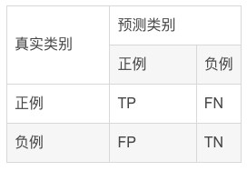
混淆矩阵中所包含的信息
- True negative(TN),称为真阴率,表明实际是负样本预测成负样本的样本数(预测是负样本,预测对了)
- False positive(FP),称为假阳率,表明实际是负样本预测成正样本的样本数(预测是正样本,预测错了)
- False negative(FN),称为假阴率,表明实际是正样本预测成负样本的样本数(预测是负样本,预测错了)
- True positive(TP),称为真阳率,表明实际是正样本预测成正样本的样本数(预测是正样本,预测对了)
ROC曲线示例
可以看到,ROC曲线的纵坐标为真阳率true positive rate(TPR)(也就是recall),横坐标为假阳率false positive rate(FPR)。
TPR即真实正例中对的比例,FPR即真实负例中的错的比例。
- 真正类率(True Postive Rate)TPR:
TPR=TP/(TP+FN)
代表分类器 预测为正类中实际为正实例占所有正实例 的比例。 - 假正类率(False Postive Rate)FPR:
FPR=FP/(FP+TN)
代表分类器 预测为正类中实际为负实例 占 所有负实例 的比例。
可以看到,右上角的阈值最小,对应坐标点(1,1);左下角阈值最大,对应坐标点为(0,0)。从右上角到左下角,随着阈值的逐渐减小,越来越多的实例被划分为正类,但是这些正类中同样也掺杂着真正的负实例,即TPR和FPR会同时增大。
- 横轴FPR: FPR越大,预测正类中实际负类越多。
- 纵轴TPR:TPR越大,预测正类中实际正类越多。
- 理想目标:TPR=1,FPR=0,即图中(0,1)点,此时ROC曲线越靠拢(0,1)点,越偏离45度对角线越好。
AUC值是什么?
AUC(Area Under Curve)被定义为ROC曲线下与坐标轴围成的面积,显然这个面积的数值不会大于1。又由于ROC曲线一般都处于y=x这条直线的上方,所以AUC的取值范围在0.5和1之间。
- AUC越接近1.0,检测方法真实性越高;
- 等于0.5时,则真实性最低,无应用价值。

ROC曲线绘制的代码实现
#导入库
from sklearn.metrics import confusion_matrix,accuracy_score,f1_score,roc_auc_score,recall_score,precision_score,roc_curve
import matplotlib.pyplot as plt
from sklearn.metrics import roc_curve, auc
import matplotlib.pyplot as plt

#绘制roc曲线
def calculate_auc(y_test, pred):
    print("auc:",roc_auc_score(y_test, pred))
    fpr, tpr, thersholds = roc_curve(y_test, pred)
    roc_auc = auc(fpr, tpr)
    plt.plot(fpr, tpr, 'k-', label='ROC (area = {0:.2f})'.format(roc_auc),color='blue', lw=2)
    plt.xlim([-0.05, 1.05])
    plt.ylim([-0.05, 1.05])
    plt.xlabel('False Positive Rate')
    plt.ylabel('True Positive Rate')
    plt.title('ROC Curve')
    plt.legend(loc="lower right")
    plt.plot([0, 1], [0, 1], 'k--')
    plt.show()
相关性热图
表示数据之间的相互依赖关系。但需要注意,数据具有相关性不一定意味着具有因果关系。
相关系数(Pearson)
相关系数是研究变量之间线性相关程度的指标,而相关关系是一种非确定性的关系,数据具有相关性不能推出有因果关系。相关系数的计算公式如下:

其中,公式的分子为X,Y两个变量的协方差,Var(X)和Var(Y)分别是这两个变量的方差。当X,Y的相关程度最高时,即X,Y趋近相同时,很容易发现分子和分母相同,即r=1。
代码实现
相关性计算
import numpy as np
import pandas as pd
# compute correlations
from scipy.stats import spearmanr, pearsonr
from scipy.spatial.distance import cdist

def calc_spearman(df1, df2):
	df1 = pd.DataFrame(df1)
	df2 = pd.DataFrame(df2)
    n1 = df1.shape[1]
    n2 = df2.shape[1]
    corr0, pval0 = spearmanr(df1.values, df2.values)
    # (n1 + n2) x (n1 + n2)
    corr = pd.DataFrame(corr0[:n1, -n2:], index=df1.columns, columns=df2.columns)
    pval = pd.DataFrame(pval0[:n1, -n2:], index=df1.columns, columns=df2.columns)
    return corr, pval

def calc_pearson(df1, df2):
	df1 = pd.DataFrame(df1)
	df2 = pd.DataFrame(df2)
    n1 = df1.shape[1]
    n2 = df2.shape[1]
    corr0, pval0 = np.zeros((n1, n2)), np.zeros((n1, n2))
    for row in range(n1):
        for col in range(n2):
            _corr, _p = pearsonr(df1.values[:, row], df2.values[:, col])
            corr0[row, col] = _corr
            pval0[row, col] = _p
    # n1 x n2
    corr = pd.DataFrame(corr0, index=df1.columns, columns=df2.columns)
    pval = pd.DataFrame(pval0, index=df1.columns, columns=df2.columns)
    return corr, pval
画出相关性图
import matplotlib.pyplot as plt
import seaborn as sns

def pvalue_marker(pval, corr=None, only_pos=False):
    if only_pos:  # 只标记正相关
        if corr is None:
            print('correlations `corr` is not provided, '
                  'negative correlations cannot be filtered!')
        else:
            pval = pval + (corr < 0).astype(float)
    pval_marker = pval.applymap(lambda x: '**' if x < 0.01 else ('*' if x < 0.05 else ''))
    return pval_marker

def plot_heatmap(
    mat, cmap='RdBu_r',
    xlabel=f'column', ylabel=f'row',
    tt='',
    fp=None,
    **kwds
):
    fig, ax = plt.subplots()
    sns.heatmap(mat, ax=ax, cmap=cmap, cbar_kws={
    'shrink': 0.5}, **kwds)
    ax.set_title(tt)
    ax.set_xlabel(xlabel)
    ax.set_ylabel(ylabel)
    if fp is not None:
        ax.figure.savefig(fp, bbox_inches='tight')
    return ax
实例
#构造有一定相关性的随机矩阵
df1 = pd.DataFrame(np.random.randn(40, 9))
df2 = df1.iloc[:, :-1] + df1.iloc[:, 1: ].values * 0.6
df2 += 0.2 * np.random.randn(*df2.shape)
#绘图
corr, pval = calc_pearson(df1, df2)
pval_marker = pvalue_marker(pval, corr, only_pos=only_pos)
tt = 'Spearman correlations'
plot_heatmap(
    corr, xlabel='df2', ylabel='df1',
    tt=tt, cmap='RdBu_r', #vmax=0.75, vmin=-0.1,
    annot=pval_marker, fmt='s',
)

only_pos 这个参数为 False 时, 会同时标记显著的正相关和负相关.
cmap属性调整颜色可选参数:
‘Accent’, ‘Accent_r’, ‘Blues’, ‘Blues_r’, ‘BrBG’, ‘BrBG_r’, ‘BuGn’, ‘BuGn_r’, ‘BuPu’, ‘BuPu_r’, ‘CMRmap’,‘CMRmap_r’, ‘Dark2’, ‘Dark2_r’, ‘GnBu’, ‘GnBu_r’, ‘Greens’, ‘Greens_r’, ‘Greys’, ‘Greys_r’, ‘OrRd’, ‘OrRd_r’, ‘Oranges’, ‘Oranges_r’, ‘PRGn’, ‘PRGn_r’, ‘Paired’, ‘Paired_r’, ‘Pastel1’, ‘Pastel1_r’, ‘Pastel2’, ‘Pastel2_r’, ‘PiYG’, ‘PiYG_r’, ‘PuBu’, ‘PuBuGn’, ‘PuBuGn_r’, ‘PuBu_r’, ‘PuOr’, ‘PuOr_r’, ‘PuRd’, ‘PuRd_r’, ‘Purples’, ‘Purples_r’, ‘RdBu’, ‘RdBu_r’, ‘RdGy’, ‘RdGy_r’, ‘RdPu’, ‘RdPu_r’, ‘RdYlBu’, ‘RdYlBu_r’, ‘RdYlGn’, ‘RdYlGn_r’, ‘Reds’, ‘Reds_r’, ‘Set1’, ‘Set1_r’, ‘Set2’, ‘Set2_r’, ‘Set3’, ‘Set3_r’, ‘Spectral’, ‘Spectral_r’, ‘Wistia’, ‘Wistia_r’, ‘YlGn’, ‘YlGnBu’, ‘YlGnBu_r’, ‘YlGn_r’, ‘YlOrBr’, ‘YlOrBr_r’, ‘YlOrRd’, ‘YlOrRd_r’, ‘afmhot’, ‘afmhot_r’, ‘autumn’, ‘autumn_r’, ‘binary’, ‘binary_r’,‘bone’, ‘bone_r’, ‘brg’, ‘brg_r’, ‘bwr’, ‘bwr_r’, ‘cividis’, ‘cividis_r’, ‘cool’, ‘cool_r’, ‘coolwarm’, ‘coolwarm_r’, ‘copper’, ‘copper_r’, ‘crest’, ‘crest_r’, ‘cubehelix’, ‘cubehelix_r’, ‘flag’, ‘flag_r’, ‘flare’, ‘flare_r’, ‘gist_earth’, ‘gist_earth_r’, ‘gist_gray’, ‘gist_gray_r’, ‘gist_heat’, ‘gist_heat_r’, ‘gist_ncar’, ‘gist_ncar_r’, ‘gist_rainbow’, ‘gist_rainbow_r’, ‘gist_stern’, ‘gist_stern_r’, ‘gist_yarg’, ‘gist_yarg_r’, ‘gnuplot’, ‘gnuplot2’, ‘gnuplot2_r’, ‘gnuplot_r’, ‘gray’, ‘gray_r’, ‘hot’, ‘hot_r’, ‘hsv’, ‘hsv_r’,‘plasma’, ‘plasma_r’, ‘prism’, ‘prism_r’, ‘rainbow’, ‘rainbow_r’, ‘rocket’, ‘rocket_r’, ‘seismic’, ‘seismic_r’, ‘spring’, ‘spring_r’, ‘summer’, ‘summer_r’, ‘tab10’, ‘tab10_r’, ‘tab20’, ‘tab20_r’, ‘tab20b’, ‘tab20b_r’, ‘tab20c’, ‘tab20c_r’, ‘terrain’, ‘terrain_r’, ‘turbo’, ‘turbo_r’, ‘twilight’, ‘twilight_r’, ‘twilight_shifted’, ‘twilight_shifted_r’, ‘viridis’, ‘viridis_r’, ‘vlag’, ‘vlag_r’, ‘winter’, ‘winter_r’
棒棒糖图
条形图在数据可视化里,是一个经常被使用到的图表。虽然很好用,也还是存在着缺陷呢。比如条形图条目太多时,会显得臃肿,不够直观。
棒棒糖图表则是对条形图的改进,以一种小清新的设计,清晰明了表达了我们的数据。
代码实现
# 导包
import matplotlib.pyplot as plt
import numpy as np
import pandas as pd

# 创建数据
x=range(1,41)
values=np.random.uniform(size=40)
# 绘制
plt.stem(x, values)
plt.ylim(0, 1.2)
plt.show()

# stem function: If x is not provided, a sequence of numbers is created by python:
plt.stem(values)
plt.show()

# Create a dataframe
df = pd.DataFrame({
    'group':list(map(chr, range(65, 85))), 'values':np.random.uniform(size=20) })

# Reorder it based on the values:
ordered_df = df.sort_values(by='values')
my_range=range(1,len(df.index)+1)
ordered_df.head()
# Make the plot
plt.stem(ordered_df['values'])
plt.xticks( my_range, ordered_df['group'])
plt.show()

# Horizontal version
plt.hlines(y=my_range, xmin=0, xmax=ordered_df['values'], color='skyblue')
plt.plot(ordered_df['values'], my_range, "D")

plt.yticks(my_range, ordered_df['group'])
plt.show()

# change color and shape and size and edges
(markers, stemlines, baseline) = plt.stem(values)
plt.setp(markers, marker='D', markersize=10, markeredgecolor="orange", markeredgewidth=2)
plt.show()

# custom the stem lines
(markers, stemlines, baseline) = plt.stem(values)
plt.setp(stemlines, linestyle="-", color="olive", linewidth=0.5 )
plt.show()

# Create a dataframe
value1=np.random.uniform(size=20)
value2=value1+np.random.uniform(size=20)/4
df = pd.DataFrame({
    'group':list(map(chr, range(65, 85))), 'value1':value1 , 'value2':value2 })

# Reorder it following the values of the first value:
ordered_df = df.sort_values(by='value1')
my_range=range(1,len(df.index)+1)
# The horizontal plot is made using the hline function
plt.hlines(y=my_range, xmin=ordered_df['value1'], xmax=ordered_df['value2'], color='grey', alpha=0.4)
plt.scatter(ordered_df['value1'], my_range, color='skyblue', alpha=1, label='value1')
plt.scatter(ordered_df['value2'], my_range, color='green', alpha=0.4 , label='value2')
plt.legend()

# Add title and axis names
plt.yticks(my_range, ordered_df['group'])
plt.title("Comparison of the value 1 and the value 2", loc='left')
plt.xlabel('Value of the variables')
plt.ylabel('Group')

# Show the graph
plt.show()

# Data
x = np.linspace(0, 2*np.pi, 100)
y = np.sin(x) + np.random.uniform(size=len(x)) - 0.2

# Create a color if the y axis value is equal or greater than 0
my_color = np.where(y>=0, 'orange', 'skyblue')
# The vertical plot is made using the vline function
plt.vlines(x=x, ymin=0, ymax=y, color=my_color, alpha=0.4)
plt.scatter(x, y, color=my_color, s=1, alpha=1)

# Add title and axis names
plt.title("Evolution of the value of ...", loc='left')
plt.xlabel('Value of the variable')
plt.ylabel('Group')

# Show the graph
plt.show()

火山图
火山图(Volcano plots)是散点图的一种,根据变化幅度(FC,Fold Change)和变化幅度的显著性(P value)进行绘制,其中标准化后的FC值作为横坐标,P值作为纵坐标,可直观的反应高变的数据点,常用于基因组学分析(转录组学、代谢组学等)。
绘制
制作差异分析结果数据框
genearray = np.asarray(pvalue)

result = pd.DataFrame({
    'pvalue':genearray,'FoldChange':fold})

result['log(pvalue)'] = -np.log10(result['pvalue'])
制作火山图的准备工作
result['sig'] = 'normal'

result['size']  =np.abs(result['FoldChange'])/10

result.loc[(result.FoldChange> 1 )&(result.pvalue < 0.05),'sig'] = 'up'
result.loc[(result.FoldChange< -1 )&(result.pvalue < 0.05),'sig'] = 'down'
ax = sns.scatterplot(x="FoldChange", y="log(pvalue)",
                      hue='sig',
                      hue_order = ('down','normal','up'),
                      palette=("#377EB8","grey","#E41A1C"),
                      data=result)
ax.set_ylabel('-log(pvalue)',fontweight='bold')
ax.set_xlabel('FoldChange',fontweight='bold')

智能推荐
java.lang.NoSuchMethodError: org.springframework.boot.builder.SpringApplicationB-程序员宅基地
文章浏览阅读788次。搭建spring cloud的时候,报以下错误:java.lang.NoSuchMethodError: org.springframework.boot.builder.SpringApplicationBuilder.<init>([Ljava/lang/Object;)V 是由于spring boot版本兼容性导致的,在pom.xml中修改配置文件,修改前:..._nosuchmethoderror: 'void org.springframework.boot.builder.springapplicationb
去除全局设置的box-sizing:border-box_box-sizing去除-程序员宅基地
文章浏览阅读4.1k次。只需要给不需要box-sizing:border-box的元素上加上box-sizing:content-box 就行_box-sizing去除
JavaWeb(14) 页面静态化之使用freemarker模板生成一个html静态页面_java实现静态模板-程序员宅基地
文章浏览阅读6.2k次。题外话: 页面静态化(展示数据从JSP页面变成HTML页面)实现方式-->模板技术 从本质上来讲,模板技术是一个占位符动态替换技术。一个完整的模板技术需要四个元素:①模板语言(使用的语法) ②包含模板语言的模板文件(.ftl结尾) ③模板引擎(jar包)④拥有动态数据的数据对象 FreeMarker是一款模板引擎:即一种基于模板和要改变的数据,并用来..._java实现静态模板
CRC16-CCITT校验算法实现(C#版)_c# static byte[] datacrc16_ccitt-程序员宅基地
文章浏览阅读6.4k次。public ushort[] CRC16Table = { 0x0000, 0x1189, 0x2312, 0x329B, 0x4624, 0x57AD, 0x6536, 0x74BF, 0x8C48, 0x9DC1, 0xAF5A, 0xBED3, 0xCA6C, 0xDBE5, 0xE97E, 0xF8F7,_c# static byte[] datacrc16_ccitt
android 图片压缩避免内存溢出的解决办法-程序员宅基地
文章浏览阅读462次。在android中的很多应用中都需要拍照上传图片,随着手机的像素越来越高,拍摄的图片也越来越大。在拍摄后显示的时候,使用universalimageloader.这个开源项目可以避免内存溢出。但是在上传的时候,一般需要压缩,但是压缩的时候很容易导致内存溢出。解决的办法就是,压缩后的二进制流,不用导出Bitmap,而是直接存储为本地文件,上传的时候直接通过本地文件上传。代码如下:1.图片压缩获..._android压缩图片会造成内存溢出
Subnet简介-程序员宅基地
文章浏览阅读2.9w次,点赞2次,收藏13次。Subnet(子网)在一般的概念中,有两个基本含义:1 这个子网的网段(CIDR)和IP版本;2 这个子网的路由(含默认路由)。事实上,Subnet模型也确实有这两个字段cidr和ip_version,分别表示一个子网的网段和IP版本。另外Subnet模型还有两字段gateway_ip和host_routes,表示一个子网的路由信息。gateway_ip是这个子网的默认网关IP。host_rout..._subnet
随便推点
Ubuntu20下安装QT5.9_qt-opensource-linux-x64-5.9.0.run-程序员宅基地
文章浏览阅读977次。安装c语言和c++环境在终端中输入sudo apt-get install gccsudo apt-get install g++使用清华开源软件镜像进行下载https://mirrors.tuna.tsinghua.edu.cn/qt/archive/qt/5.9/5.9.0/进入下载文件所在的位置,进入终端执行命令chmod +x qt-opensource-linux-x64-5.9.0.run然后点开刚刚那个安装包下载即可(这里我全部勾选安装了)安装统一字体配置库_qt-opensource-linux-x64-5.9.0.run
opencv-python常用函数解析及参数介绍(八)——轮廓与轮廓特征_python opencv提取圆轮廓-程序员宅基地
文章浏览阅读986次,点赞2次,收藏9次。在前面的文章中我们已经学会了使用膨胀与腐蚀、使用梯度、使用边缘检测的方式获得图像的轮廓,那么在获得轮廓后我们可以对图像进行什么样的操作呢?本文将介绍轮廓的绘制与轮廓特征的使用。_python opencv提取圆轮廓
linux redis自动关闭问题_linux redis启动 linux redis启动一会后自动关闭-程序员宅基地
文章浏览阅读4.3k次,点赞5次,收藏5次。linux 自动关闭的问题问题:redis.clients.jedis.exceptions.JedisDataException: MISCONF Redis is configured to save RDB snapshots, but it is currently not able to persist on disk. Commands that may modify the data set are disabled, because this instance is configured_linux redis启动 linux redis启动一会后自动关闭
【SpringCloud-Alibaba系列教程】14.一文教你入门RocketMQ_《芋道 spring cloud alibaba 消息队列 rocketmq 入门-程序员宅基地
文章浏览阅读560次。<本文已参与 RocketMQ Summit 优秀案例征文活动,点此了解详情>MQ简介MQ(Message Queue)是一种跨进程的通信机制,用于消息传递。通俗点说,就是一个先进先出的数据结构。MQ应用场景异步解耦很多场景不使用MQ会产生各个应用见紧密耦合在在一起,其实我们要遵循的原则就是高内聚低耦合,通过上图我们就可以看到,消息生产者,不管消息消费者状态如何,生产好的消息就直接投递到MQ中,消息消费者也是同样,不管消息生产者如何,只取MQ中的消息进行处理。这是解耦.._《芋道 spring cloud alibaba 消息队列 rocketmq 入门
基于微信小程序的校园导航小程序设计与实现_简单的校园导航微信小程序怎么弄-程序员宅基地
文章浏览阅读1k次,点赞23次,收藏41次。今天带来的是基于SpringBoot的校园导航微信小程序设计与实现,智能化的管理方式可以大幅降低学校的运营人员成本,实现了校园导航的标准化、制度化、程序化的管理,有效地防止了校园导航的随意管理,提高了信息的处理速度和精确度,能够及时、准确地查询和修正建筑速看等信息。课题主要采用微信小程序、SpringBoot架构技术,前端以小程序页面呈现给学生,结合后台java语言使页面更加完善,后台使用MySQL数据库进行数据存储。微信小程序主要包括学生信息、校园简介、建筑速看、系统信息等功能。_简单的校园导航微信小程序怎么弄
The server time zone value ‘�й���ʱ��‘ is unrecognized or represents more than one time zone.-程序员宅基地
文章浏览阅读33次。java.sql.SQLException: The server time zone value '�й���ʱ��' is unrecognized or represents more than one time zone.