Flutter入门-组件学习_flutter 内置组件-程序员宅基地
技术标签: flutter
基础组件
- Text
- Button
- ElevatedButton,漂浮按钮,默认有背景颜色、阴影效果,按下后阴影会变大。
- TextButton,文本按钮,就是可点击的文本。默认背景透明、不带阴影,按下后会有背景色。
- OutlineButton,边框按钮,默认有一个边框、背景透明、不带阴影,按下后边框颜色会变亮、出现背景(弱)、阴影(弱)。
- IconButton,图标按钮,没有文字,默认没有背景,点击会出现背景。
- FloatingActionButton,悬浮按钮
- 自定义Button,所有的按钮都是直接或间接对RawMaterialButton组件的包装定制。
- 说明:ElevatedButton、TextButton、OutlineButton都可以添加icon。
- Image
- Dialog
- Date
- 表单组件
- TextField
- Checkbox、CheckboxListTile
- Radio、RadioListTile
- Switch
Text
查看源代码
示例1
const Text("hello world")
示例2
const Text(
      "hello world",
      maxLines: 3,
      textAlign: TextAlign.center,
      style: TextStyle(color: Colors.black),
),
Button
查看源代码
示例1
ElevatedButton(
    onPressed: () {
    },
    style: ButtonStyle(
        //背景颜色
        backgroundColor: MaterialStateProperty.all(Colors.red),
        //字体颜色
        foregroundColor: MaterialStateProperty.all(Colors.white),
        //阴影颜色
        shadowColor: MaterialStateProperty.all(Colors.blue),
        //阴影大小
        elevation: MaterialStateProperty.all(20.0),
        //按钮圆角
        shape: MaterialStateProperty.all(
          RoundedRectangleBorder(borderRadius: BorderRadius.circular(10)),
        )),
    child: const Text("按钮"),
  ),
示例2
TextButton(
      onPressed: () {
    },
      child: const Text("按钮"),
  ),
示例3
OutlinedButton(
    onPressed: () {
    },
    style: ButtonStyle(
        //字体颜色
        foregroundColor: MaterialStateProperty.all(Colors.black),
        //边框粗细、颜色
        side: MaterialStateProperty.all(
          const BorderSide(width: 1, color: Colors.red),
        )),
    child: const Text("按钮"),
  ),
示例4
IconButton(
    onPressed: () {
    },
    icon: const Icon(Icons.home),
  ),
示例5
FloatingActionButton(
      child: const Text("按钮"),
      onPressed: () {
    },
    ),
示例6,scaffold属性组件
floatingActionButton: FloatingActionButton(
        backgroundColor: Colors.red,
        onPressed: () {
    },
        child: const Icon(Icons.add),
      ),
Image
示例1,加载网络图片
Image.network(
      "https://xxx.png",
      width: 100,
      height: 100,
      fit: BoxFit.cover, //使用最多。可能拉伸或裁剪,但是不会变形且填满容器。
      //repeat: ImageRepeat.repeatX,
    ),
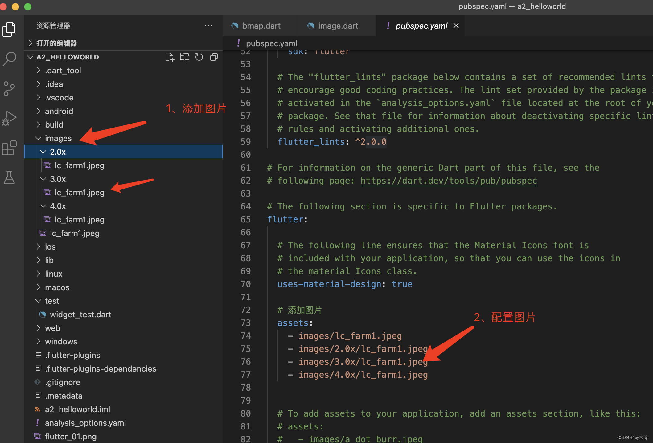
示例2,加载本地图片
Image.asset('images/lc_farm1.jpeg', height: 100),
加载本地图片需要进行配置,同一张图片可以配置不同分辨率的,方便适配。
示例3,加载等比例图片
AspectRatio(
    aspectRatio: 16.0 / 9.0,
    child: Image.network(
      "https://www.itying.com/images/flutter/1.png",
      fit: BoxFit.cover,
    ),
  ),
Dialog
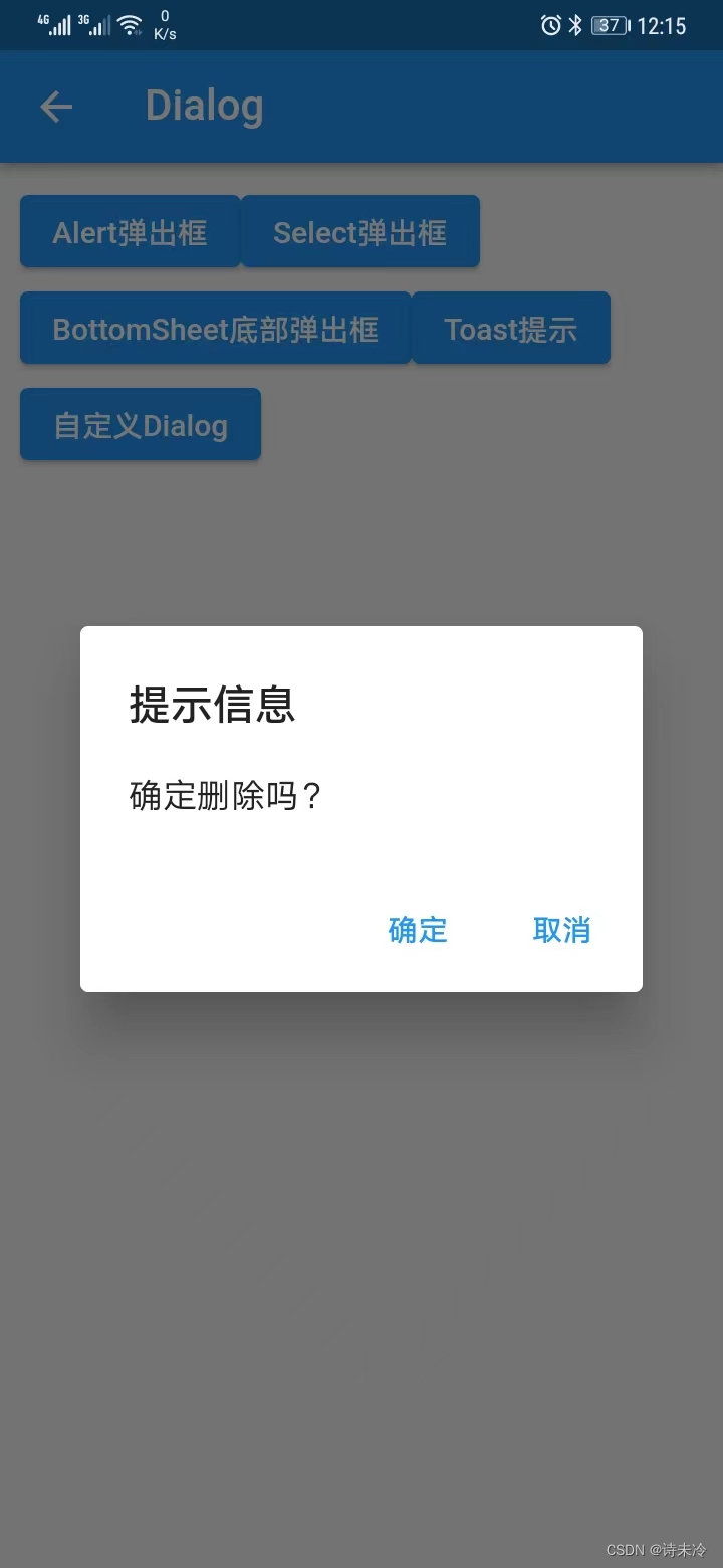
示例1:AlertDialog
 /*
   * showDialog是一个Future方法,也就是异步方法,我们可以使用async和await
   */
  void _alertDialog() async {

    var result = await showDialog(
        context: context,
        builder: (context) {

          return AlertDialog(
            title: const Text("提示信息"),
            content: const Text("确定删除吗?"),
            actions: [
              TextButton(
                  onPressed: () {

                    debugPrint("click 确定");
                    //pop可以传值,也可以不传值,传值的话可以传递状态给外面。
                    Navigator.of(context).pop("OK");
                  },
                  child: const Text("确定")),
              TextButton(
                  onPressed: () {

                    debugPrint("click 取消");
                    Navigator.of(context).pop("Cancle");
                  },
                  child: const Text("取消")),
            ],
          );
        });

    debugPrint("result=$result");
  }
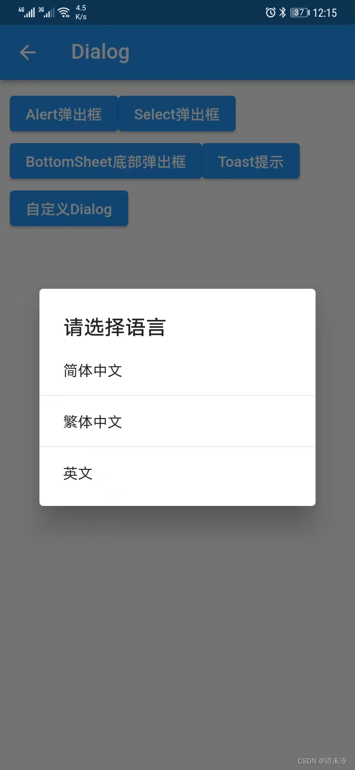
示例2
/*
   *  如果需要在外部接收对话框的值,可以使用async和await来异步处理,使用pop传递点击结果。
   */
  void _simpleDialog() {

    showDialog(
        context: context,
        //点击对话框外面对话框是否消失,默认true
        barrierDismissible: true,
        builder: (context) {

          return SimpleDialog(
            title: const Text("请选择语言"),
            children: [
              SimpleDialogOption(
                child: const Text("简体中文"),
                onPressed: () {

                  debugPrint("简体中文");
                  Navigator.of(context).pop();
                },
              ),
              const Divider(),
              SimpleDialogOption(
                child: const Text("繁体中文"),
                onPressed: () {

                  debugPrint("繁体中文");
                  Navigator.of(context).pop();
                },
              ),
              const Divider(),
              SimpleDialogOption(
                child: const Text("英文"),
                onPressed: () {

                  debugPrint("英文");
                  Navigator.of(context).pop();
                },
              ),
            ],
          );
        });
  }
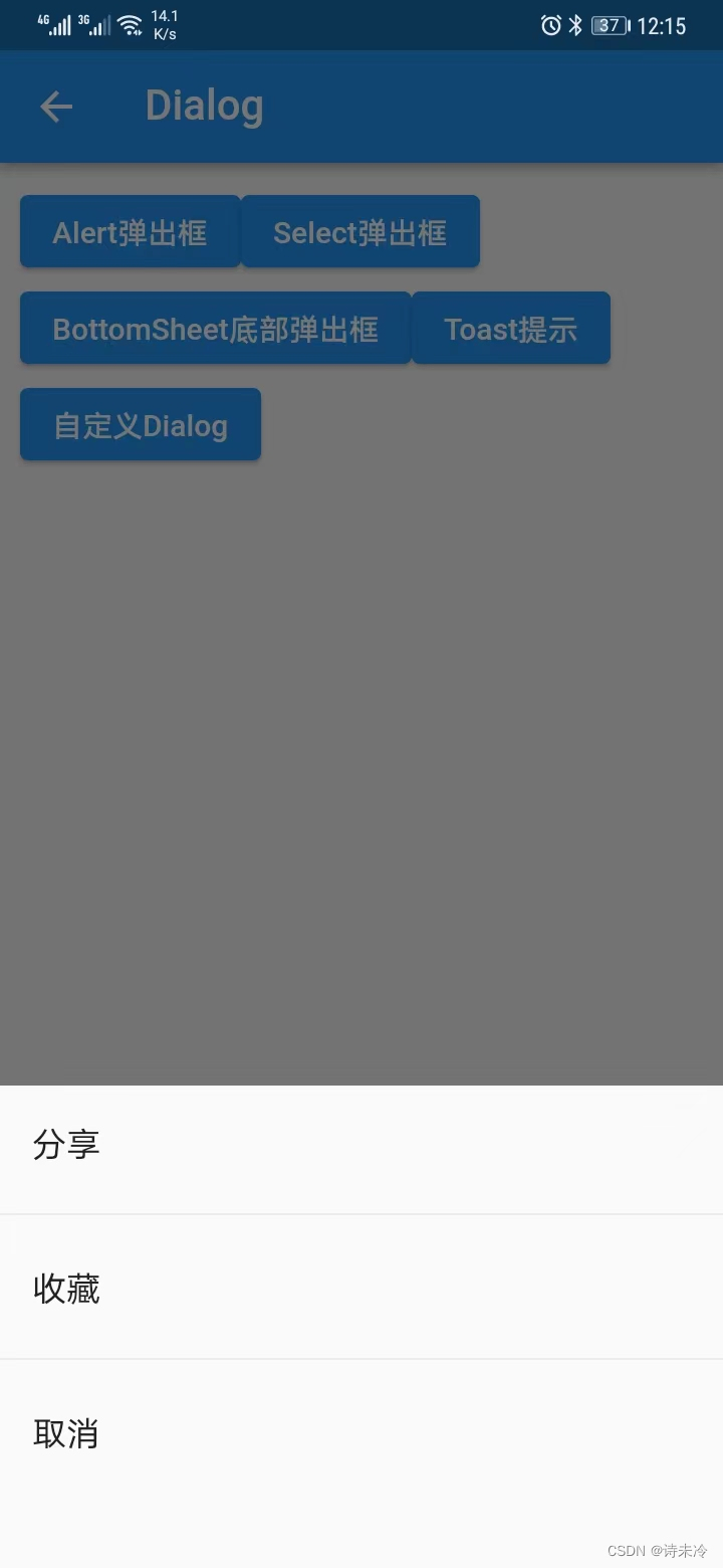
示例3:
/*
   *  如果需要在外部接收对话框的值,可以使用async和await来异步处理,使用pop传递点击结果。
   */
  void _bottomSheet() {

    showModalBottomSheet(
        context: context,
        builder: (context) {

          return SizedBox(
            height: 240,
            child: Column(
              children: [
                ListTile(
                  title: const Text("分享"),
                  onTap: () {

                    debugPrint("click 分享");
                    Navigator.of(context).pop();
                  },
                ),
                const Divider(),
                ListTile(
                  title: const Text("收藏"),
                  onTap: () {

                    debugPrint("click 收藏");
                    Navigator.of(context).pop();
                  },
                ),
                const Divider(),
                ListTile(
                  title: const Text("取消"),
                  onTap: () {

                    debugPrint("click 取消");
                    Navigator.of(context).pop();
                  },
                ),
              ],
            ),
          );
        });
  }
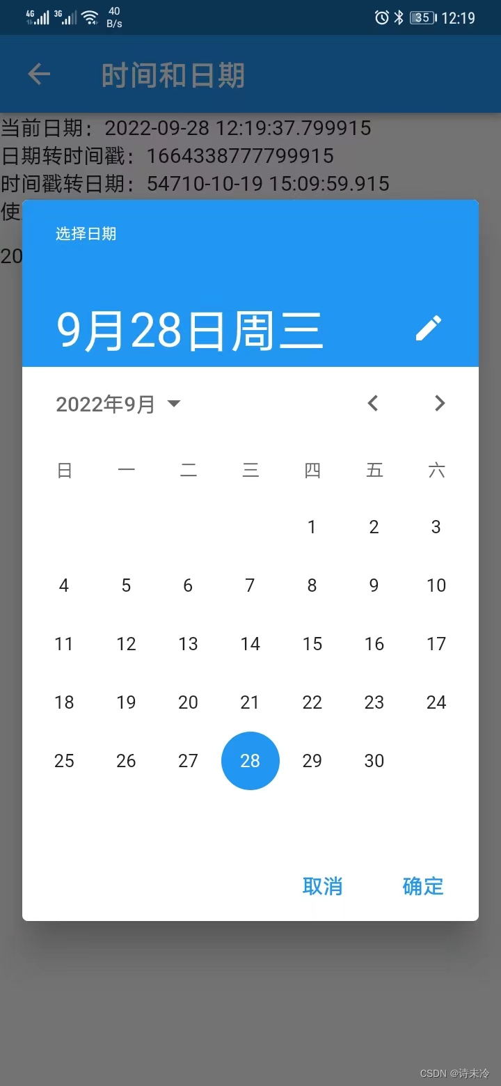
date
示例1,日期选择器
 void _showDatePicker() {

    showDatePicker(
      context: context,
      initialDate: DateTime.now(),
      firstDate: DateTime(2001),
      lastDate: DateTime(2050),
      //locale: const Locale('zh'),
    ).then((value) {

      debugPrint("获取选中的日期:$value");
    });
  }
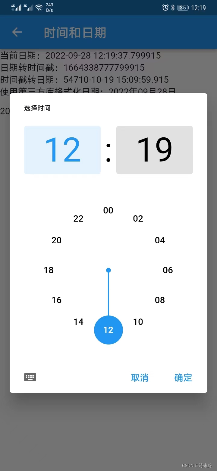
示例2,时间选择器
void _showTimePicker() async {

    var result = await showTimePicker(
      context: context,
      initialTime: TimeOfDay.now(),
    );

    setState(() {

      if (result != null) {

        _choiceTime = result;
      }
    });
  }
表单型组件
示例1,Checkbox
child: Column(
    children: [
      Checkbox(
          value: c1,
          onChanged: (v) {

            setState(() => {
    c1 = v!});
          }),
      Text(c1 ? "选中" : "未选中"),
      CheckboxListTile(
        value: c1,
        onChanged: (v) => {

          setState(() => {
    c1 = v!})
        },
        title: const Text("标题"),
        subtitle: const Text("二级标题"),
      ),
      const Divider(height: 1.0),
      CheckboxListTile(
        value: c1,
        onChanged: (v) => {

          setState(() => {
    c1 = v!})
        },
        title: const Text("标题"),
        subtitle: const Text("二级标题"),
        //设置图片,类似ListTitle的leading属性
        secondary: const Icon(Icons.home),
      ),
    ],
  ),
示例2,Radio
Row(
      children: [
        const Text("男"),
        Radio(
            value: 1,
            groupValue: sex,
            onChanged: (v) {

              setState(() => {
    sex = v!});
            }),
        const Text("女"),
        Radio(
            value: 0,
            groupValue: sex,
            onChanged: (v) {

              setState(() => {
    sex = v!});
            }),
        const SizedBox(width: 50),
        Text("选中性别:${
      sex == 1 ? '男' : '女'}"),
      ],
    ),
示例3,RadioListtile
RadioListTile(
      value: 0,
      groupValue: choice,
      title: const Text("标题"),
      subtitle: const Text("二级标题"),
      secondary: const Icon(Icons.help),
      selected: choice == 0,
      onChanged: (v) {

        setState(() {

          choice = v!;
        });
      }),
示例4,switch
Switch(value: s1, onChanged: _switchChanged),
示例5,TextField
body: Column(
      children: [
        const SizedBox(height: 10),
        const MyTextFieldDemo(),
        const SizedBox(height: 10),
        TextField(
          decoration: const InputDecoration(hintText: "请输入用户名"),
          controller: username,
        ),
        TextField(
          obscureText: true,
          decoration: const InputDecoration(hintText: "请输入密码"),
          onChanged: (value) {

            password = value;
          },
        ),
        const SizedBox(height: 20),
        ElevatedButton(
            onPressed: () {

              debugPrint("用户名=${
      username.text},密码=$password");
            },
            child: const Text("按钮"))
      ],
    ),
容器类组件
- 框架组件:
- MaterialApp,程序入口组件
- Scaffold,带主题样式标题栏的组件
- 容器:
- Container
- SizeBox
- Padding,给组件设置内边距,因为很多组件没有padding属性。
- 流式布局:
- Wrap
- 线性布局:
- Row,水平布局
- Column,垂直布局
- Expanded,在Row和Column中使用,弹性布局,均分/占满剩余空间
- 层叠布局
- Stack,层叠布局
- Stack+Align,实现定位布局,本质还是层叠布局
- Stack+Positioned,实现定位布局,本质还是层叠布局
Padding/Container/SizeBox
示例1,Padding
Padding(
  padding: EdgeInsets.fromLTRB(0, 0, 0, 5),
  child: Image.network(
    "https://www.itying.com/images/flutter/1.png",
  ),
),
示例2,Container
SizedBox(height: 5),
示例3,Container
return Container(
      width: 100.0,
      height: 100.0,
      color: Colors.red,
      child: Center(
        child: Icon(
          icon,
          color: color,
          size: size,
        ),
      ),
    );
Row/Column/Expanded
示例1,Row
//自定义icon容器组件
class IconContainer extends StatelessWidget {
double size = 32;
Color color = Colors.white;
IconData icon;
IconContainer(this.color, this.size, this.icon);
Widget build(BuildContext context) {
return Container(
width: 100.0,
height: 100.0,
color: Colors.red,
child: Center(
child: Icon(
icon,
color: color,
size: size,
),
),
);
}
}
//使用Row进行布局
class HomeContent extends StatelessWidget {
Widget build(BuildContext context) {
return Row(
mainAxisAlignment: MainAxisAlignment.spaceEvenly, //均分空间
children: [
IconContainer(Colors.white, 32, Icons.home), //自定义组件
IconContainer(Colors.white, 32, Icons.settings),
IconContainer(Colors.white, 32, Icons.search),
],
);
}
}
示例2,Column
class HomeContent extends StatelessWidget {
Widget build(BuildContext context) {
return Container(
width: 2000, //分配较大数值,就可以占满屏幕空间
child: Column(
mainAxisAlignment: MainAxisAlignment.spaceEvenly, //均分空间
crossAxisAlignment: CrossAxisAlignment.center, //重心
children: [
IconContainer(Colors.white, 32, Icons.home),
IconContainer(Colors.white, 32, Icons.settings),
IconContainer(Colors.white, 32, Icons.search),
],
),
);
}
}
示例3,Expanded,右侧固定大小,左侧自适应占满剩余空间,主要就是flex属性
class HomeContent extends StatelessWidget {
Widget build(BuildContext context) {
return Row(
children: [
Expanded(
child: IconContainer(Colors.black, Colors.red, 15, Icons.home),
flex: 1),
IconContainer(Colors.black, Colors.green, 15, Icons.home),
],
);
}
}
Wrap
示例
class HomeContent extends StatelessWidget {
Widget build(BuildContext context) {
return Container(
width: 500,
height: 500,
color: Colors.grey,
child: Wrap(
spacing: 10,
runSpacing: 10,
alignment: WrapAlignment.start,
runAlignment: WrapAlignment.end,
children: [
MyButton('button1'),
MyButton('button22222'),
MyButton('button3'),
MyButton('button4444'),
MyButton('button5'),
MyButton('button66666666'),
MyButton('button1'),
MyButton('button22222'),
MyButton('button3'),
MyButton('button4444'),
MyButton('button5'),
MyButton('button66666666'),
],
),
);
}
}
Stack
层叠布局,类似FrameLayout
class HomeContent extends StatelessWidget {
Widget build(BuildContext context) {
return Center(
child: Stack(
alignment: Alignment.center,
children: [
Container(
width: 300,
height: 400,
color: Colors.red,
),
Text('我是文本'),
],
),
);
}
}
功能型组件
- 列表
- ListView,线性布局
- GridView,网络布局
- AnimatedList,动画列表,列表item增加删除时有动画效果
- 图片轮播:Pageview
- 固定宽高比:AspectRatio
- 卡片:Card
- 头像组件:CircleAvatar,显示为圆形的头像效果
- 日期选择器和时间选择器:
- showDatePicker()、DateTime.now()
- showTimePicker()、TimeOfDay.now()
- 对话框
- 提示对话框,在showDialog中返回AlertDialog
- 选择对话框,在showDialog中返回SimpleDialog
- 底部对话框,在showModalBottomSheet中返回Widget
- 自定义对话框,在showDialog中返回MyDialog
- 说明:如果想获取对话框中的按钮点击状态,也就是点击了哪个按钮,可以使用async和await来异步获取,因为showDialog的返回值是一个Future类型的,是异步的。
- 点击事件组件,InkWell,给组件包裹上,组件就有了点击事件。
- 手势组件,GestureDetector,给组件包裹上,组件就有了单击事件、双击事件、长按事件等。
ListView
示例1,基本列表
return ListView(
  children: <Widget>[
    ListTile(
      title: Text('列表标题'),
      subtitle: Text('列表二级标题'),
    ),
    ListTile(
      title: Text('列表标题'),
      subtitle: Text('列表二级标题'),
    ),
    ListTile(
      title: Text('列表标题'),
      subtitle: Text('列表二级标题'),
    ),
  ],
);
示例2,图文混排列表
return ListView(
  children: <Widget>[
    ListTile(
      leading: Image.network(
        'https://xxx.png',
        width: 50,
        height: 50,
      ),
      title: Text('列表标题'),
      subtitle: Text('列表二级标题'),
    ),
    ListTile(
      leading: Image.network(
        'https://xxx.png',
        width: 50,
        height: 50,
      ),
      title: Text('列表标题'),
      subtitle: Text('列表二级标题'),
    ),
  ],
);
GridView
body: GridView.count(
        crossAxisCount: 2,
        crossAxisSpacing: 10.0,
        mainAxisSpacing: 10.0,
        padding: const EdgeInsets.all(10.0),
        children: _getListData(),
      ),
图片轮播
return Scaffold(
      appBar: AppBar(title: const Text("PageView")),
      body: PageView(
        scrollDirection: Axis.horizontal, //滑动的方向,默认水平
        children: [
          Center(child: Text("第一屏", style: Theme.of(context).textTheme.headline1)),
          Center(child: Text("第二屏", style: Theme.of(context).textTheme.headline1)),
          Center(child: Text("第三屏", style: Theme.of(context).textTheme.headline1)),
          Center(child: Text("第四屏", style: Theme.of(context).textTheme.headline1)),
        ],
      ),
    );
Scaffold属性组件
- appBar,标题栏
- floatingActionbar,悬浮按钮
- bottomnavigationBar,底部导航栏
- drawer,左抽屉
- Drawer,抽屉组件
- DrawerHeader,抽屉头部组件
- UserAccountsDrawerHeader,专门定义用户信息的抽屉头部组件
- endDrawer,右抽屉,同理
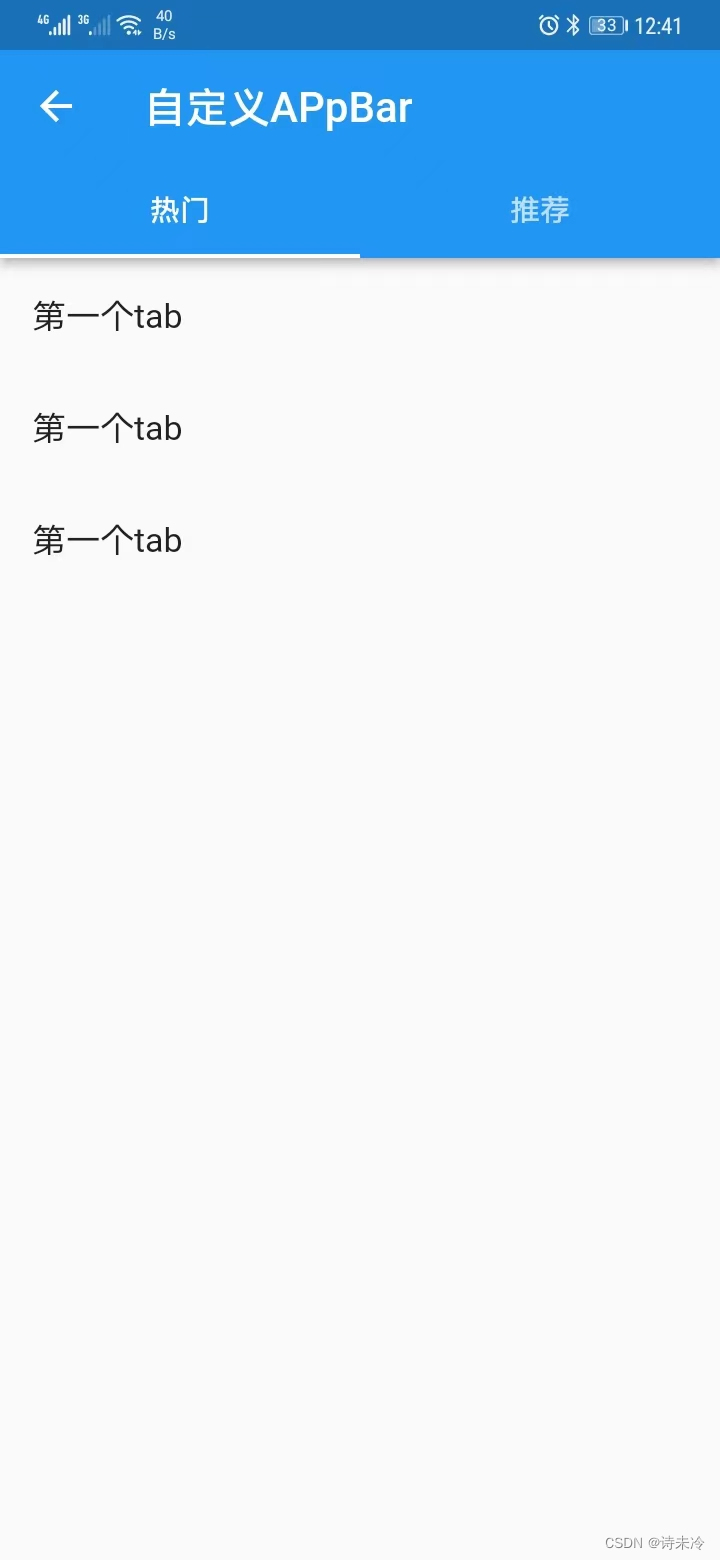
- title,Tabbar,Tab导航,结合body设置TabBarView
标题栏
appBar: AppBar(title: const Text("PageView")),
Tab导航
import 'package:flutter/material.dart';
class TabBarSample1 extends StatelessWidget {
const TabBarSample1({
super.key});
Widget build(BuildContext context) {
return DefaultTabController(
length: 2,
child: Scaffold(
appBar: AppBar(
title: const Text("自定义APpBar"),
bottom: const TabBar(tabs: [
Tab(text: "热门"),
Tab(text: "推荐"),
]),
),
//TabbarView的children数量和顺序必须和TabBar对应
body: TabBarView(children: [
ListView(
children: const [
ListTile(title: Text("第一个tab")),
ListTile(title: Text("第一个tab")),
ListTile(title: Text("第一个tab")),
],
),
ListView(
children: const [
ListTile(title: Text("第二个tab")),
ListTile(title: Text("第二个tab")),
ListTile(title: Text("第二个tab")),
],
),
]),
));
}
}
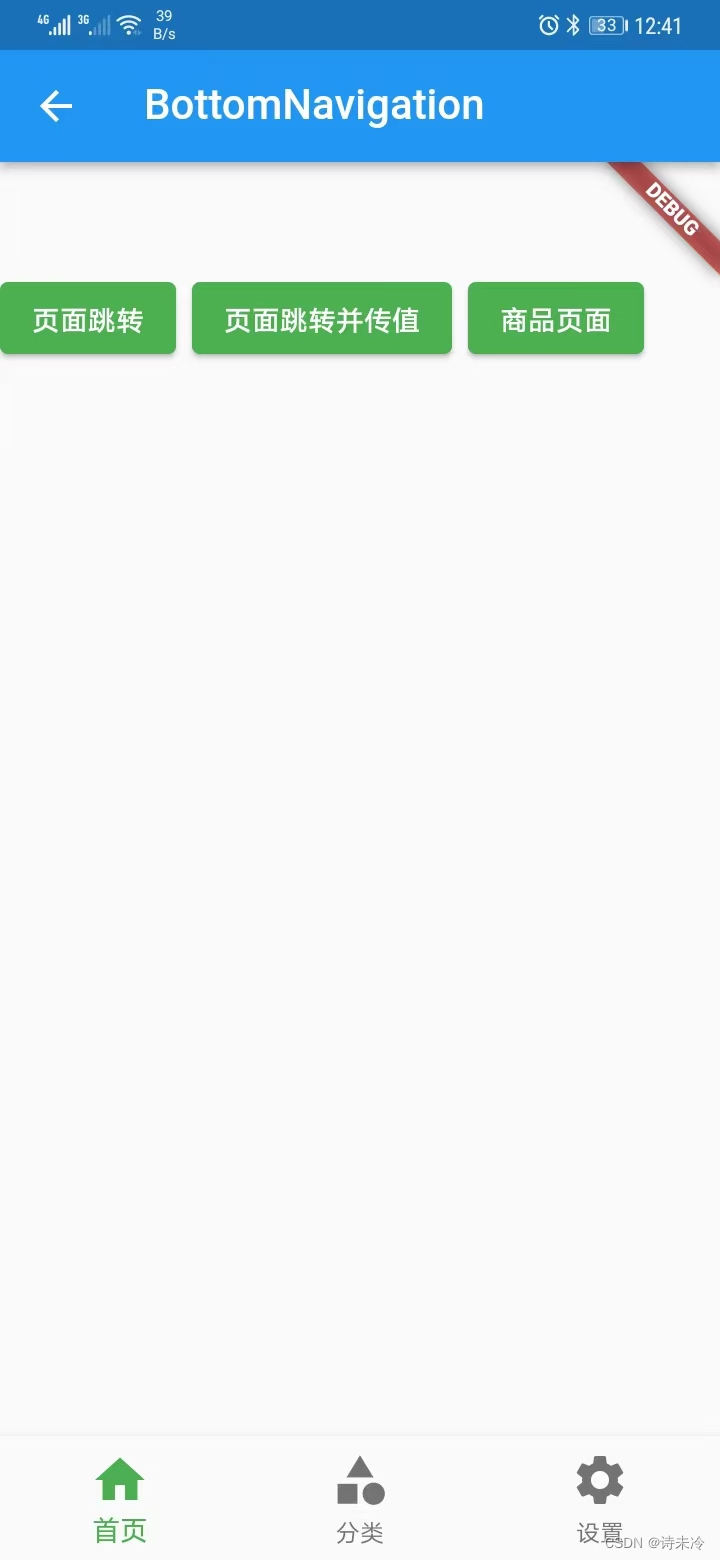
底部导航
return Scaffold(
      body: _pageList[_currentIndex], //点击标签,显示不同的页面
      bottomNavigationBar: BottomNavigationBar(
        currentIndex: _currentIndex,
        onTap: (index) {

          debugPrint("当前选择index:$index");
          setState(() {

            _currentIndex = index;
          });
        },
        iconSize: 30.0, //icon大小
        //fixedColor: Colors.red, //选中颜色
        //type: BottomNavigationBarType.fixed, //配置底部可以放多个按钮
        items: const [
          BottomNavigationBarItem(icon: Icon(Icons.home), label: "首页"),
          BottomNavigationBarItem(icon: Icon(Icons.category), label: "分类"),
          BottomNavigationBarItem(icon: Icon(Icons.settings), label: "设置"),
        ],
      ),
    );
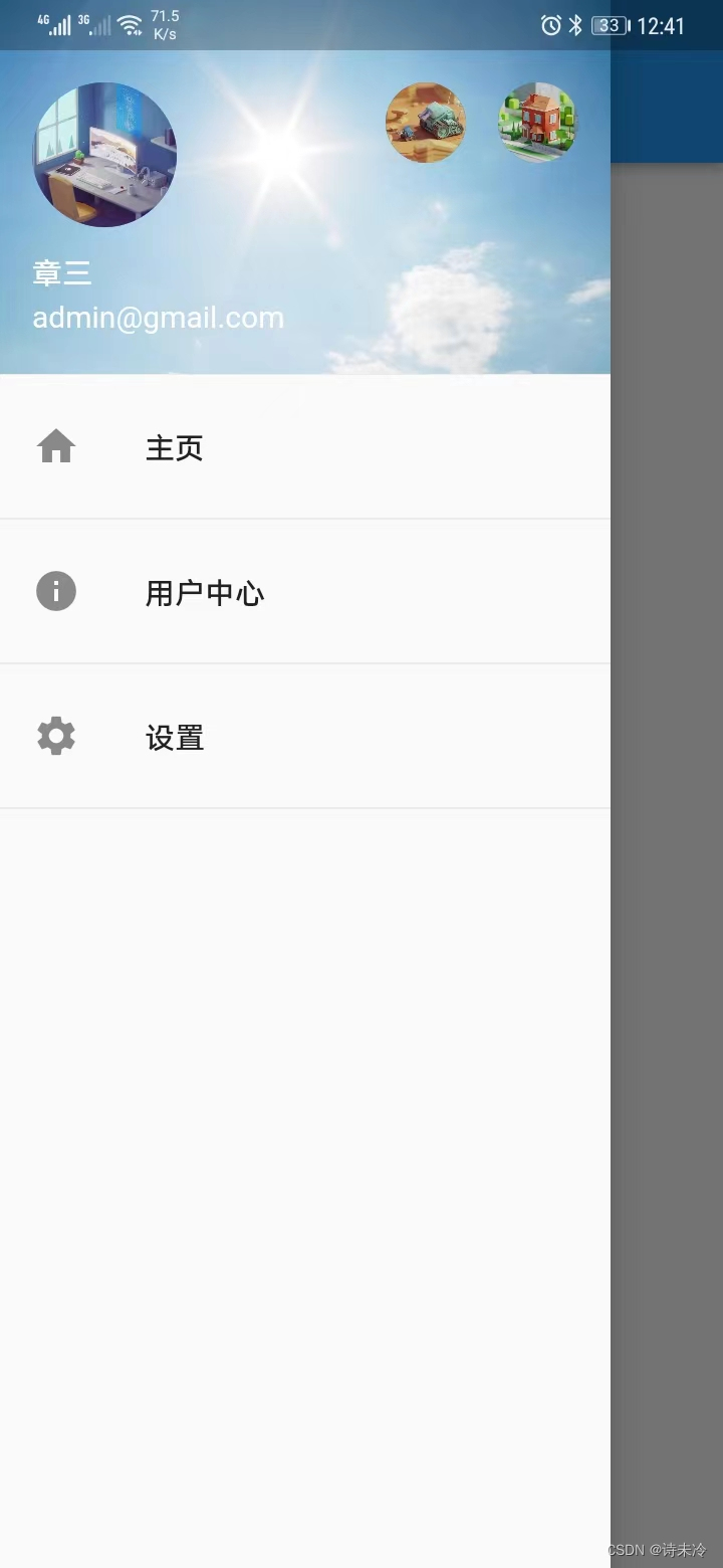
抽屉
// ignore_for_file: prefer_const_constructors
import 'package:flutter/material.dart';
class DrawerPage extends StatelessWidget {
const DrawerPage({
super.key});
Widget build(BuildContext context) {
return Scaffold(
appBar: AppBar(
title: const Text("抽屉页面"),
),
drawer: Drawer(
child: Column(
children: [
const UserAccountsDrawerHeader(
accountName: Text("章三"),
accountEmail: Text("[email protected]"),
currentAccountPicture: CircleAvatar(
backgroundImage: NetworkImage("https://xxx.png"),
),
otherAccountsPictures: [
CircleAvatar(backgroundImage: NetworkImage("https://xxx.png")),
CircleAvatar(backgroundImage: NetworkImage("https://xxx.png")),
],
decoration: BoxDecoration(
image: DecorationImage(
image: NetworkImage(
"https://xxx.png"),
fit: BoxFit.cover),
),
),
ListTile(leading: Icon(Icons.home), title: Text("主页")),
Divider(),
ListTile(
leading: Icon(Icons.info),
title: Text("用户中心"),
onTap: () {
Navigator.of(context).pop(); //关闭侧边栏
Navigator.pushNamed(context, '/userCenter'); //跳转
},
),
Divider(),
ListTile(leading: Icon(Icons.settings), title: Text("设置")),
Divider(),
],
),
),
);
}
}
智能推荐
物联网开发技术栈_物联网技术java技术栈-程序员宅基地
文章浏览阅读2.2k次,点赞2次,收藏10次。物联网开发技术栈 内容简介作为互联网技术的进化,物联网开发并非孤立的技术栈,而是向上承接了互联网,向下统领了嵌入式硬件开发的一个承上启下的全栈开发技术。虽然我们并不能预测物联网技术栈最终的样子:统一的开发语言是 JavaScript 还是 Python 亦或者其他编程语言;HTTP、WebSockets、MQTT、CoAP 等协议谁会是最后的赢家,并且随着物联网的不断进化,甚至我们..._物联网技术java技术栈
《Git学习笔记:Git入门 & 常用命令》-程序员宅基地
文章浏览阅读674次,点赞10次,收藏11次。Git是一个分布式版本控制工具,通常用来对软件开发过程中的源代码文件进行管理,通过Git仓库来存储和管理这些文件,Git仓库分为两种:指的是存储在各个开发人员自己本机电脑上的Git仓库指的是远程服务器上的Git仓库commit:提交,将本地文件和版本信息保存到本地仓库push:推送(上传),将本地仓库文件和版本信息上传到远程仓库pull:拉取(下载),将远程仓库文件和版本信息下载到本地仓库。
CPU热点分析——pprof (gperftools)使用_gperftools pprof-程序员宅基地
文章浏览阅读4.6k次。pprof (gperftools)使用谷歌的工具集,可查看CPU采样结果。pprof (google-perftool),用于来分析程序,必须保证程序能正常退出。使用步骤:1.准备工具,先安装工具包libunwind-1.1.tar.gzgperftools-2.1.tar.gz解压后 configure到系统默认路径即可,之后直接-lprofiler 2.再安装图形工具sudo yum ins..._gperftools pprof
JavaScript BOM-程序员宅基地
文章浏览阅读118次。JavaScript BOM:Navigator、History、Location
MongoDB数据库 —— 图形化工具_mongodb数据库图形化工具-程序员宅基地
文章浏览阅读6.2k次,点赞16次,收藏66次。在前面通过使用MongoDB在命令窗口操作数据库,而MySQL数据库也同样可以在命令窗口使用sql语句操作数据库,在安装数据库的时候提到可以安装这个图形化工具的,为了节省安装时间和卡顿选择后续安装MongoDB图形化工具,在MySQL数据中同样也有这个MySQL workbench 图形化工具可以选择进行安装;那么本篇就来安装MongoDB的图形化工具 — MongoDBCompass。_mongodb数据库图形化工具
ChatGPT带给智慧城市的启示——未来城市演进路径的探讨-程序员宅基地
文章浏览阅读1.4k次,点赞13次,收藏10次。未来城市的大模型包括城市总体规划、城市交通运输管理、城市公共安全和应急管理、经济发展和产业园区发展、社区发展、资源承载调控、污染调控、社会资源优化调控、基础设施调控、人口研究等模型。其对城市要素、关键指标、函数、流程、模型、平台、技术、资金、人才、市场、自然环境等内外部因素进行仿真建模。采用物联网、云计算、大数据、数字孪生和人工智能等技术来获取地、物、人、组织、环境、社会、经济、业务逻辑和运营规律等相关数据。、物联网、大数据、云计算、数字孪生、元宇宙、可穿戴生理传感器、分布式新能源等各类新技术。
随便推点
从零开始开发Shopify主题:(4)调用自定义配置_shopify自定义主题-程序员宅基地
文章浏览阅读3.6k次。在上一篇文章中,我们知道了如何使用配置文件自定义主题,以允许商店所有者自己更改Shopify主题。 如上所述,这些设置会在用户单击管理面板的在线商店>主题部分中的自定义主题按钮时显示,并在主题开发文件的config / settings_schema.json文件中定义。在这篇文章中,我们将了解如何访问这些设置并在开发主题时调用它们。调用配置要调用模板中的配置信息,需要使用li..._shopify自定义主题
git本地分支与远程分支关联及遇到的问题解决方案_本地分支 '(no branch)' (远程分支 = '(no branch)') 是无效的。引用名-程序员宅基地
文章浏览阅读2.6k次。1.查看本地分支git branch绿色表示当前分支#######################################################2.查看远程分支git branch -a#######################################################3.切换分支git checkout branch_name..._本地分支 '(no branch)' (远程分支 = '(no branch)') 是无效的。引用名称必须遵循
java连接mysql出现The server time zone value '�й���ʱ��' is unrecognized的解决方法_java.lang.runtimeexception: the server time zone v-程序员宅基地
文章浏览阅读2.2w次,点赞18次,收藏28次。java连接mysql出现The server time zone value '�й���ʱ��' is unrecognized的解决方法在Idea中连接数据库是抛出The server time zone value ‘�й���ʱ��’ is unrecogni错误 原因是因为使用了Mysql Connector/J 6.x以上的版本,然后就报了时区的错误。解决办法在配置url中添..._java.lang.runtimeexception: the server time zone value '嚙請對蕭嚙踝蕭
鸿蒙原生应用元服务实战-Serverless华为账户认证登录需尽快适配-程序员宅基地
文章浏览阅读671次,点赞11次,收藏9次。并且在这个固定的serverless服务中去增加这个,应该不是应用元服务开发者有这个加入权限的,应该是要统一解决,类似实现和手机注册验证一样的,直接可以使用或者少量代码配置即可使用。另外就是如果是新的元服务应用,使用的serverless,如果不支持华为账户功能,就没法上架,这个也是比较麻烦的,前面已经使用serverless开发基本完成或者已经完成的,得用其他方式去实现才行吧。对于已经上架的应用和元服务、升级也没法进行。3月1日的时间是快到了。
使用XAMPP可视化管理Mysql,使用JDBC访问数据库执行插入、查询、删除等操作_xammp进入可视化界面-程序员宅基地
文章浏览阅读5.7k次,点赞2次,收藏8次。准备工作:安装XAMPP,登陆apache,mysql,并通过phpadmin来创建数据库,新建一个表,插入一些数据:http://localhost/phpmyadmin,最好设置密码,不然后面连接数据库的时候可能会无法访问设置密码方式:修改密码--->一定要使用生成的密码来登陆,包括后面的数据库url也是。我简历的数据如下:这时候就可以在eclipse中编程开发_xammp进入可视化界面
(转) spring 的jar各包作用-程序员宅基地
文章浏览阅读119次。转自:http://blog.csdn.net/cailiang517502214/article/details/4797642spring.jar是包含有完整发布的单个jar包,spring.jar中包含除了spring-mock.jar里所包含的内容外其它所有jar包的内容,因为只有在开发环境下才会用到spring-mock.jar来进行辅助测试,正式应用系统中是用不得这些类的。...